
Pixel-Perfect Web Design With Framer: Complete Guide
Pixel-Perfect Web Design With Framer: Complete Guide
Jun 3, 2025
Why Pixel-Perfect Design Actually Matters
In the world of web design, pixel-perfect design refers to a site's visual presentation being exactly as intended by the designer. It's about more than just aesthetics; it creates a seamless user experience that fosters trust and encourages engagement. This precision directly impacts user behavior and, ultimately, a business's bottom line.
The Hidden Costs of Sloppy Design
Imagine visiting a website with misaligned images, overlapping text, and awkwardly placed buttons. These details can instantly undermine confidence in a website's credibility. Inconsistent spacing or jarring typography, for example, can make a site appear unprofessional, leading users to question the quality of the products or services offered. This can result in lost conversions and missed opportunities.
Additionally, sloppy design can have technical repercussions. Cross-browser compatibility and responsiveness issues can further alienate users. A website that looks perfect in one browser but is broken in another will frustrate visitors and damage a brand's reputation.
How Precision Transforms Perception
Pixel-perfect design, especially when achieved with tools like Framer, addresses these challenges. Meticulously crafting every element, from spacing and typography to visual hierarchy, creates a sense of order and professionalism that instills trust. This attention to detail signals a commitment to quality that extends beyond the website itself.
This is particularly important in diverse digital landscapes like India. Achieving pixel perfection means ensuring a smooth user experience across various internet speeds and devices. Framer empowers designers to create websites that are both visually appealing and intuitively accessible. Balancing global design standards with local preferences is crucial for building trust and familiarity among users. Incorporating familiar visual elements and interaction patterns strengthens user engagement. Learn more about UI/UX design for Indian businesses here. Design's importance is highlighted by the fact that 75% of judgments about a website's credibility are based on its design, and 83% of consumers value a seamless experience across devices.
Beyond Aesthetics: Performance and Accessibility
Pixel-perfect design with Framer isn't solely about visual appeal; it directly impacts performance and accessibility. Optimized images and clean code contribute to faster loading times, crucial for user satisfaction and search engine rankings. A well-structured website also improves accessibility for users with disabilities, widening reach and demonstrating inclusivity. This focus on precision translates to tangible business outcomes.
Case Studies: The Power of Pixels
Numerous case studies demonstrate how pixel-perfect design principles lead to significant improvements in conversion rates. Websites redesigned with a focus on precision often see a dramatic increase in user engagement and sales. This proves that investing in pixel-perfect web design with Framer isn't merely cosmetic but a strategic move that directly contributes to business success. This attention to detail, combined with Framer's capabilities, allows for the creation of websites that are both beautiful and highly effective.
Setting Up Framer For Design Success
Creating pixel-perfect web designs in Framer is more than just knowing the software. It's about having a structured approach, much like building a house requires a blueprint and a solid foundation. A well-organized Framer project is your foundation for design success. This section guides you through essential setup steps used by professional designers.
Workspace Organization: Your Design Hub
Start by decluttering your digital workspace. A clean Framer project, like a tidy desk, keeps you focused and streamlines your workflow. Use clear naming conventions for files and layers. For instance, "hero-section-heading" is much clearer than "text-layer-1". This small step makes a big difference when navigating complex projects.
Framer's built-in organizational features are also key. Group related elements using frames, creating a visual hierarchy. Think of frames as containers for different design sections. This organized structure simplifies editing, revisions, and collaboration with other designers.
Grid Systems and Layout Precision
Grid systems are fundamental for pixel-perfect web design. They ensure consistent spacing and alignment, forming a framework that dictates how elements are positioned, similar to a building's foundation. Framer's grid tools let you define columns, gutters, and margins with pixel-level accuracy. This precision creates clean, balanced layouts that translate seamlessly across devices. You might find this resource helpful: How to edit text in Framer templates.
Mastering Framer's auto-layout feature is also important. Auto-layout intelligently adjusts spacing and alignment as content changes, saving you from manual adjustments. It's like a dynamic grid that adapts to your design, maintaining consistency effortlessly.
Component Libraries: Building Blocks of Efficiency
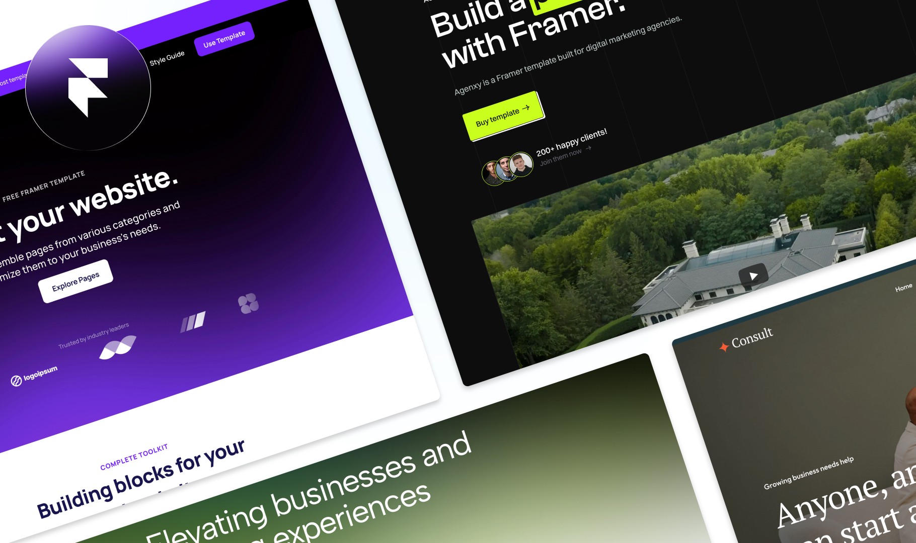
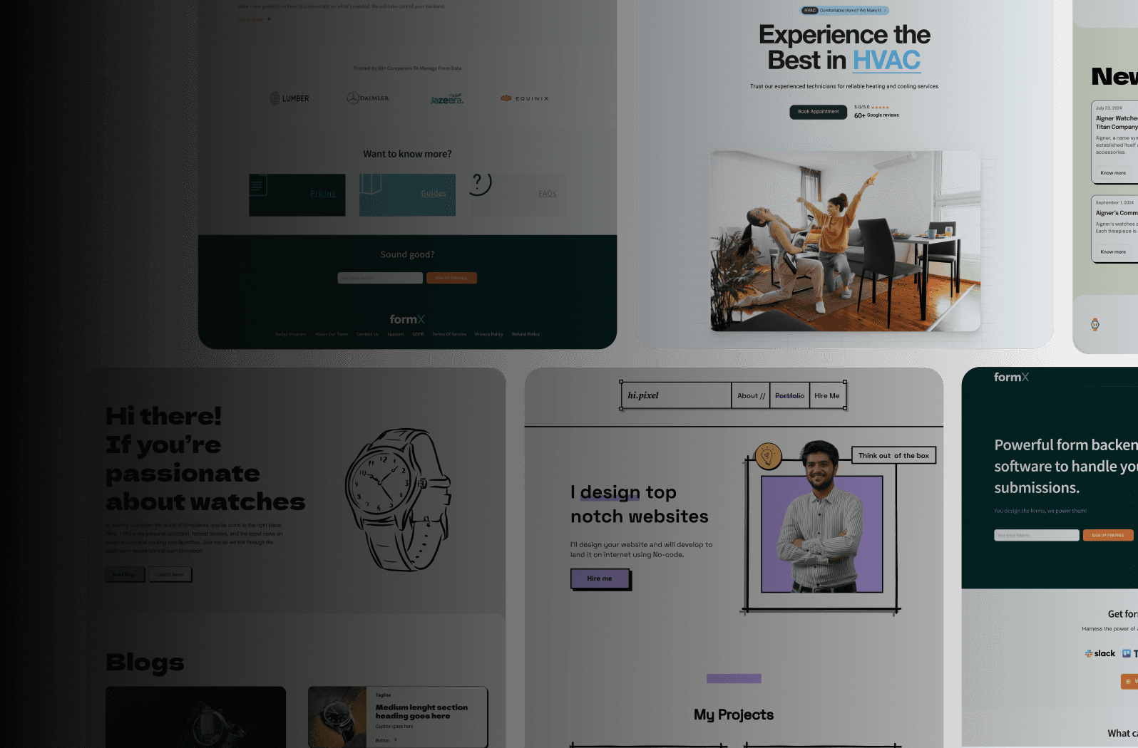
Component libraries are collections of reusable design elements, like buttons and headers. They're like pre-fabricated building materials, enabling you to quickly assemble consistent designs. Framer excels at component management, letting you create and organize libraries for use across projects. This drastically reduces design time and ensures consistency across your web presence.
Design tokens take reusability further. These named variables store design values like colors and fonts. Changing a single token updates every instance of that value across your project. Imagine changing your brand's primary color with one click. This systematic approach greatly streamlines design workflows. Professional designers using structured Framer setups report 65% faster project completion and 80% fewer revisions. Organized component libraries reduce design inconsistencies by 90%. Find more statistics here. This efficiency boosts profitability and client satisfaction.
Collaboration Workflows for Seamless Teamwork
Framer's real-time collaboration features enable seamless teamwork. Multiple designers can work on the same project at the same time, improving communication and reducing revisions. This is invaluable for projects with tight deadlines or dispersed teams. The streamlined workflow minimizes confusion and back-and-forth.
By implementing these foundational setup techniques, you're building a solid base for pixel-perfect web design in Framer. This isn't just about aesthetics; it’s about a structured, efficient workflow that yields exceptional results. This sets the stage for creating responsive designs and compelling animations, which we’ll explore later.
Mastering Responsive Design That Actually Works
Creating a website that looks great on a large screen is only half the battle. With the diverse range of devices used across India, responsive design is essential. It's about building websites that adapt seamlessly to any screen size, providing a consistent user experience whether someone is browsing on a high-end smartphone or a budget-friendly feature phone. This involves moving beyond fixed breakpoints and embracing fluidity in your design thinking. You might be interested in: How to master responsive layouts in Framer.
Fluid Typography and Flexible Layouts: The Foundation of Responsiveness
One of the core principles of responsive design is fluid typography. This means font sizes should adjust proportionally to the screen size, ensuring readability across devices. Think of it like water adapting to the shape of its container.
Similarly, flexible layouts use relative units like percentages instead of fixed pixels. This allows content to reflow gracefully as the screen size changes.
Smart Component Behavior: Adapting to Different Contexts
Responsive design also involves designing smart components. These components adjust their behavior based on the available screen space.
For example, a complex navigation menu on a desktop might collapse into a hamburger menu on a mobile device. This ensures key functionalities remain accessible without overwhelming smaller screens.
This infographic visualizes key features designers prioritize when choosing design tools. It highlights the importance of layout tools, interactive prototyping, and team collaboration. Layout tools are the most valued feature, emphasizing the importance of flexible and adaptive designs, a cornerstone of responsive web design. These insights underscore the importance of choosing a design tool that supports these key aspects.
Thinking Beyond Desktop-First and Mobile-First
Traditional approaches like desktop-first or mobile-first have their limitations. While they provide a starting point, they can lead to compromises on the other end of the spectrum.
Truly responsive design requires a device-agnostic approach. You consider all screen sizes from the outset. This is where Framer's capabilities shine, enabling fluid designs that feel native on every device.
The following table provides optimal breakpoint strategies and design considerations for different devices:
Device Breakpoint Optimization Strategies
Device Type | Screen Size | Design Priority | Framer Features |
|---|---|---|---|
Feature Phone | < 320px | Core functionality, readability | Adaptive layouts, simplified components |
Smartphone | 320px - 767px | Touch optimization, concise content | Mobile-first components, gesture interactions |
Tablet | 768px - 1023px | Enhanced content, multi-column layouts | Responsive typography, flexible grids |
Desktop | 1024px+ | Full functionality, detailed information | Desktop-optimized layouts, complex interactions |
This table summarizes how different device types require specific design considerations and how Framer features can be used to address them. The focus shifts from basic functionality on feature phones to richer experiences on larger screens.
Furthermore, responsive design is crucial in India due to high mobile internet penetration. With many people accessing the internet primarily through smartphones, prioritizing mobile users is essential for reaching a wide audience. 85% of Indian users expect mobile sites to be as good as or better than their desktop counterparts. This reflects the global trend where 90% of websites have embraced responsive design. Learn more about responsive web design in India here. This shift towards mobile-first and responsive design is crucial for business success in India’s growing digital market.
Testing and Optimization: Ensuring Quality Across Devices
Finally, thorough testing is essential for any responsive design process. Use a variety of real devices and emulators to ensure your design functions flawlessly across different screen sizes, operating systems, and browsers. This helps identify and fix inconsistencies early, maintaining pixel-perfect quality on every device. This consistent testing, along with performance optimization, are crucial for building a truly responsive and user-friendly website. By incorporating these principles and utilizing powerful tools like Framer, you can create websites that cater effectively to the diverse Indian market, ensuring both user satisfaction and business success.
Creating Animations That Enhance User Experience
Animations can transform a typical user experience into something truly enjoyable. However, too many or poorly designed animations can have the opposite effect, creating a distracting and frustrating experience. This section explores using Framer's animation capabilities to create purposeful micro-interactions that boost usability and engagement.
The Power of Purposeful Animation
Think of animation as a subtle guide for your users. It can direct their attention, provide feedback, and create a seamless feel within the user interface. A simple hover effect on a button, for instance, confirms the button's interactivity. A smooth page transition makes navigation feel less jarring.
These seemingly small details contribute significantly to a polished and professional user experience. Strategic animations can also have a big impact on user engagement.
Websites with well-designed micro-interactions have seen increases in user engagement rates by 23% and session durations by 31%. Well-placed animations can even reduce perceived loading times by up to 40%, making your website feel much more responsive. Learn more about the impact of animation on UX. This data highlights the substantial benefits of purposeful animation.
Mastering Framer's Animation Toolkit
Framer offers a robust toolkit for creating sophisticated animations without needing to write code. Let's explore some key principles:
Timing: The duration of your animation is critical. Too fast, and it might be missed entirely. Too slow, and it becomes tedious. The goal is to create a natural feel.
Easing: Easing refers to how an animation accelerates and decelerates. Linear easing (constant speed) rarely feels natural. Framer provides various easing curves, such as "ease-in-out," which mimic real-world motion.
Choreography: Choreography refers to how multiple animations work together. Well-choreographed animations create a sense of flow and visual hierarchy. For example, elements entering the screen could be staggered slightly for a more engaging effect.
Practical Examples: Animations in Action
Here are some examples of effective animations you can create in Framer:
Loading States: Replace static loading spinners with engaging animations that provide visual feedback. This keeps users informed and reduces perceived wait times.
Form Feedback: Use animations for clear feedback during form interactions. A subtle shake on an invalid input field instantly communicates an error.
Hover Effects: Add visual feedback to buttons and other interactive elements on hover. This clarifies what's clickable and adds a touch of polish.
Page Transitions: Smooth page transitions create a more fluid and engaging navigation experience. Framer allows for custom transitions that can reinforce your brand identity.
Optimization and Pitfalls: Avoiding Animation Overload
While animations enhance user experience, overuse or improper implementation can be detrimental. Here’s how to avoid common pitfalls:
Performance: Complex animations can impact performance, especially on lower-end devices. Optimize your animations for smooth performance across all devices using Framer's built-in performance tools.
Distraction: Animations should never distract from the core content. Keep them subtle and purposeful, avoiding excessive or flashy animations that detract from your message.
Accessibility: Remember users with disabilities. Offer controls to disable animations for those who prefer a static experience, promoting inclusivity.
By focusing on purposeful micro-interactions, mastering Framer's animation toolkit, and optimizing for performance, you can create pixel-perfect designs that are visually appealing and user-friendly. Animation should always enhance, not hinder, the user experience. This strategic approach elevates your designs, resulting in engaging websites that captivate users and drive results.
Building Design Systems That Scale
Creating a truly scalable and efficient design process means going beyond a simple collection of components. It's about establishing a systematic design foundation that can grow and adapt as your projects do. Think of it as building a house: you wouldn't start without a blueprint. A design system is that blueprint for your digital presence. This section explores how to build one in Framer.
Establishing a Solid Foundation: Typography, Color, and Spacing
The cornerstone of any good design system lies in consistent typography, color palettes, and spacing conventions. These elements define your brand's visual language and are key to a unified user experience.
Typography Scales: Establish clear hierarchies for headings, body text, and captions. Framer lets you define these styles once and apply them consistently.
Color Systems: Develop a well-defined color palette that embodies your brand identity. Use Framer’s design tokens to manage these colors, ensuring consistency across all elements.
Spacing Conventions: Set clear guidelines for margins, padding, and overall spacing. This creates visual harmony and enhances readability. Think of it as the rhythm in music – consistent spacing allows for a pleasant visual flow.
These core elements, like the foundation of a house, provide a stable base for all other design decisions. This ensures consistency while allowing for creative freedom and efficient scaling.
Structuring Your Component Library: Reusability and Efficiency
A well-organized component library is essential for efficiency. This collection of reusable design elements speeds up your workflow and maintains consistency across projects. Framer's robust component management features make this process smooth. Much like a carpenter uses pre-cut lumber, you can use pre-built components to assemble designs quickly.
Organized Structure: Categorize your components logically. For example, group all button variations together.
Design Tokens: Use design tokens to manage values like colors, fonts, and spacing within your components. This makes system-wide updates remarkably efficient.
Version Control: Implement version control to track changes and prevent design drift. This ensures consistency across projects, even as your design system evolves. It’s like tracking versions of a document, allowing for easy rollback and preventing accidental overwrites.
Organizations with well-documented design systems experience significant efficiency gains. They report 47% faster development cycles and 68% fewer design-related bugs. Systematic approaches like this also reduce design debt by an average of 73%. Learn more about these benefits here. These improvements directly translate to cost savings and better product quality.
Documentation and Team Adoption: Ensuring Success
A design system is only as good as its adoption rate. This requires clear documentation and effective communication within your team.
Detailed Documentation: Document each component, including its purpose, usage guidelines, and variations.
Style Guides: Create a comprehensive style guide covering typography, color palettes, spacing conventions, and component usage.
Training and Workshops: Run training sessions to familiarize your team with the design system and ensure proper implementation.
These efforts guarantee consistent implementation and maximize the advantages of using a design system within Framer. By fostering shared understanding and consistent application, you’ll achieve pixel-perfect designs across even the largest projects. This ultimately streamlines workflows, boosts efficiency, and elevates the quality of your web design work.
Learning From Real Success Stories
Let's move past the theoretical and explore real-world examples of successful pixel-perfect web design with Framer. Analyzing award-winning projects offers valuable insights into what separates good design from truly exceptional results. We'll look behind the scenes, examining the design choices, technical implementation, and user experience strategies that drove measurable business impact. For inspiration, check out these 7 amazing Framer websites.
Deconstructing Success: Case Study Analysis
Honest case study breakdowns provide valuable lessons, not just from successes, but also from failures. Examining projects across different industries reveals common patterns in high-performing designs.
For example, a successful e-commerce website might prioritize clear product photography and a streamlined checkout process. A SaaS landing page, on the other hand, could focus on showcasing key features and benefits through compelling animations created with Framer.
These analyses offer practical insights you can apply to your own projects. By understanding the reasoning behind specific design decisions, you gain a deeper understanding of how to achieve similar results. Identifying common pitfalls can also help you avoid repeating mistakes.
Measurable Outcomes: The Impact of Pixel-Perfect Design
Each example we explore will include specific techniques, the tools used, and, most importantly, the measurable outcomes achieved. This data-driven approach provides concrete evidence of the impact of pixel-perfect design.
For instance, we might see how a redesigned website with optimized animations in Framer led to a 20% increase in conversion rates. We could also examine how a company improved user engagement by 30% by implementing a more intuitive navigation system designed with Framer.
This emphasis on measurable results provides a practical framework for evaluating the effectiveness of your own design choices. Pixel-perfect design with Framer isn't simply about aesthetics; it's about achieving tangible business results. This approach empowers you to create websites that not only look great, but also perform exceptionally well.
Indian E-commerce and the Rise of Framer
Framer’s adoption for web design is gaining momentum in India. As of May 2025, 141 e-commerce stores in India are using Framer, indicating a growing appreciation for tools that facilitate pixel-perfect design. This allows businesses to enhance user experience and aesthetics in a highly competitive market. Find more detailed statistics here. Tools like Framer are crucial for Indian businesses to stand out by offering visually appealing and user-friendly websites, enabling them to compete effectively in the global market. This trend underscores the increasing importance of design tools that prioritize precision and responsiveness in diverse digital landscapes like India's.
Applying Lessons Learned: From Theory to Practice
By studying real-world successes and understanding the underlying principles, you’ll be better equipped to apply these learnings to your own projects. This approach bridges the gap between theory and practice, providing a practical roadmap for achieving pixel-perfect web design with Framer. This hands-on approach provides a more concrete understanding of what makes a design truly successful, allowing you to create websites that not only look good, but also deliver exceptional user experiences and achieve tangible business objectives. These real-world examples will further solidify your understanding of key concepts and give you the confidence to create your own stunning, high-performing websites with Framer.
Key Takeaways For Professional Results
Achieving pixel-perfect web design with Framer requires more than just design skills. It demands a systematic approach to quality assurance, testing, and optimization. These key takeaways, drawn from real-world experience, will elevate your Framer projects from amateur attempts to professional showcases.
Quality Assurance: Ensuring Precision From Start To Finish
Quality assurance isn't an afterthought; it's an integral part of the design process. Think of it as a craftsman meticulously checking their work at every stage. This proactive approach prevents small errors from becoming major problems down the line.
Design Review Checklists: Create detailed checklists for every design element, from typography and spacing to responsiveness and animation. This structured approach ensures nothing is overlooked.
Cross-Browser and Cross-Device Testing: Test your Framer designs across various browsers like Chrome, Firefox, Safari, and Opera on both desktop and mobile devices. This helps catch compatibility issues early on.
User Testing: Conduct user testing with a representative sample of your target audience to identify potential usability problems. This feedback is invaluable for fine-tuning the user experience.
These quality control measures are crucial for ensuring your design appears exactly as intended across different devices and platforms, setting your work apart with its professionalism.
Performance Optimization: Speed And Efficiency
Performance is a critical aspect of user experience. A slow-loading website can lead to user frustration and high bounce rates. Framer's capabilities allow for optimization without compromising design integrity.
Image Optimization: Use optimized images in appropriate formats like WebP and AVIF to minimize file sizes without sacrificing quality. This drastically improves loading times.
Code Optimization: Write clean and efficient code, minimizing unnecessary scripts and styles. This improves rendering speed and overall performance.
Caching Strategies: Implement appropriate caching strategies to store frequently accessed data. This reduces server load and speeds up content delivery for returning visitors.
These optimizations are important for ensuring websites are accessible and enjoyable for everyone.
Client Handoff: Ensuring Seamless Transitions
The client handoff process is the final step in ensuring your pixel-perfect design remains intact. A smooth handoff fosters trust and demonstrates professionalism.
Detailed Documentation: Provide clear documentation explaining your design decisions, technical implementation, and any specific requirements for maintenance or updates.
Style Guides and Asset Libraries: Deliver well-organized style guides and asset libraries to ensure future updates remain consistent with the original design.
Training and Support: Offer training to clients on managing and updating their Framer website. This empowers them to maintain design consistency.
The following table provides a comprehensive checklist to help maintain pixel-perfect quality throughout your project.
The table below, "Quality Assurance Checklist For Pixel-Perfect Design," provides a comprehensive checklist covering key design review criteria and testing requirements to ensure high-quality outputs.
Category | Checkpoint | Priority Level | Tools/Methods |
|---|---|---|---|
Design | Typography consistency | High | Framer Design Tools, Browser Developer Tools |
Design | Spacing and alignment | High | Framer Grid System, Browser Developer Tools |
Responsiveness | Mobile layout accuracy | High | Framer Responsive Preview, Real Device Testing |
Responsiveness | Tablet layout accuracy | High | Framer Responsive Preview, Real Device Testing |
Performance | Page load speed | High | Google PageSpeed Insights, GTmetrix |
Accessibility | Keyboard navigation | High | Keyboard testing, Accessibility checkers |
Content | Image optimization | Medium | Image compression tools |
Content | Broken link check | Medium | Automated link checkers |
Animation | Smoothness and consistency | Medium | Framer animation tools, Browser performance tools |
This checklist helps ensure a thorough quality assurance process, leading to a polished and professional final product.
By adhering to these key takeaways and implementing these practices, you'll consistently deliver pixel-perfect designs with Framer, enhancing user experience, and contributing to a stronger online presence.
Elevate Your Web Design With Framerry
Want to ensure your website is not just visually stunning but also technically superior from day one? Framerry specializes in pixel-perfect web design and development using Framer. We build high-performance websites in days, not weeks. Visit Framerry to learn more about our tailored solutions and take your online presence to the next level.
Ready to take your animations to the next level?
Master pixel-perfect web design with Framer using proven strategies that drive results. Learn responsive


Ready to elevate your website? Let’s bring your vision to life with Framer.