
Designing seamless user experiences: responsive layouts in Framer
Mastering User Experience Design: Seamless Responsive Layouts in Framer
Oct 24, 2024
In today's digital landscape, creating an intuitive and seamless user experience (UX) is paramount. A well-designed UX can significantly impact how users interact with a website or application, influencing their engagement, satisfaction, and even conversion rates. However, as users access websites through a wide array of devices, responsive design has become a crucial aspect of modern UX design.
Enter Framer, a powerful tool for designing and prototyping responsive layouts that offer seamless user experiences. With its dynamic design capabilities and intuitive interface, Framer allows designers to create visually engaging, responsive layouts with ease. In this blog, we’ll explore how to use Framer to design seamless user experiences with responsive layouts and why mastering this skill is essential for any digital designer.
Understanding User Experience Design
At its core, user experience design (UX design) focuses on enhancing the way users interact with digital products. The goal is to provide value, ease of use, and an overall pleasant experience when navigating a website or application. Key components of UX design include:
Usability: How easy and intuitive is it for users to complete tasks?
Accessibility: Ensuring that everyone, including people with disabilities, can engage with the product.
Aesthetic Design: Creating an appealing visual design that aligns with the product's goals and brand identity.
A well-executed UX design increases user satisfaction and engagement. Users are more likely to stay on your site longer and return if their experience is seamless, intuitive, and enjoyable. The importance of responsive layouts comes into play when these experiences need to remain consistent across different screen sizes and devices.
Importance of Responsive Layouts
Responsive layouts ensure that a website or application adapts smoothly to different screen sizes, providing a consistent experience whether a user is on a smartphone, tablet, or desktop. Without responsive design, users may encounter broken layouts, difficult navigation, and an overall frustrating experience, which often leads to higher bounce rates and reduced user engagement.
Key benefits of responsive layouts include:
Improved usability across devices: Responsive designs allow users to have a consistent and optimized experience regardless of the device they’re using.
Increased SEO rankings: Search engines, like Google, prioritize websites that are mobile-friendly and provide a seamless experience across devices.
Cost-effective and time-saving: Rather than designing multiple website versions for different devices, responsive design enables you to maintain a single version that adjusts dynamically.
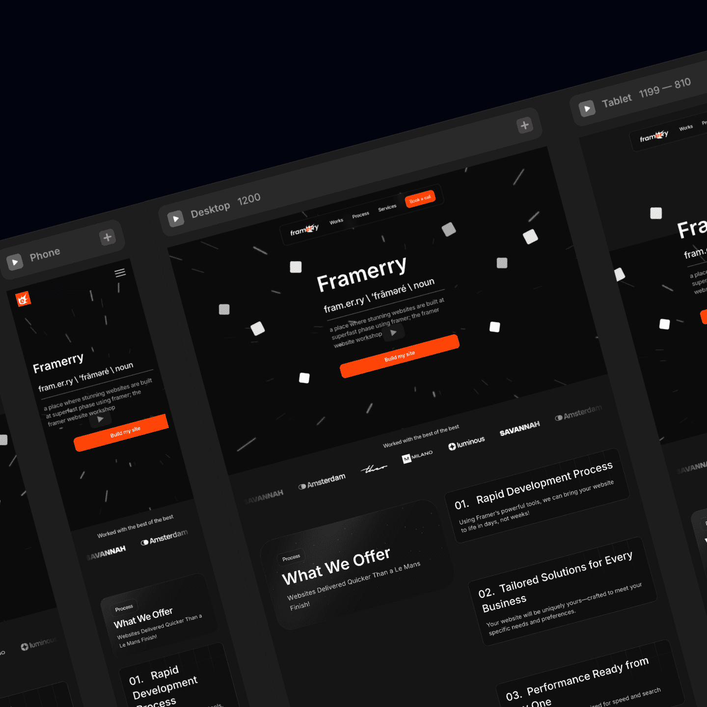
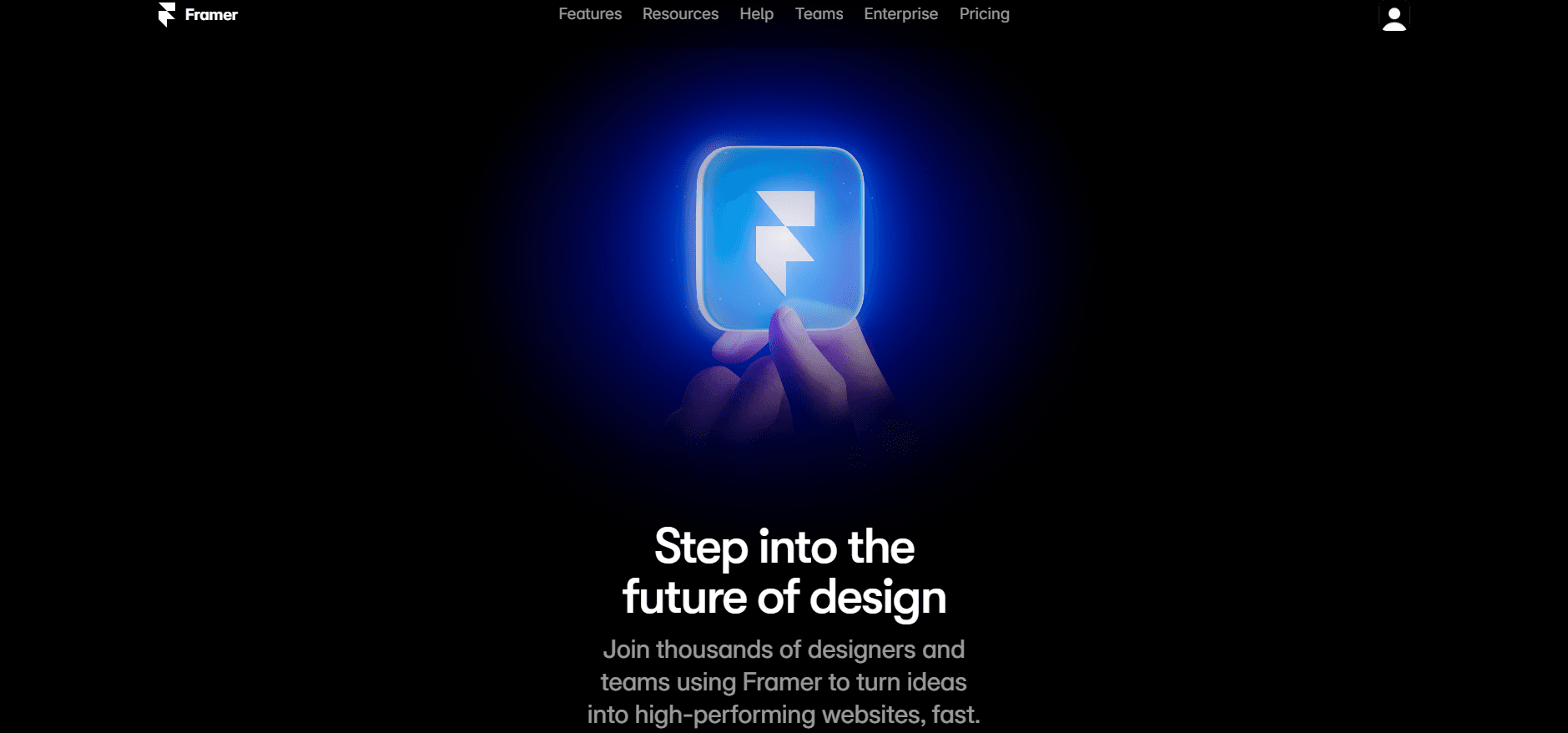
Getting Started with Framer
Framer is an all-in-one design tool that’s built for UX designers looking to create interactive prototypes and responsive layouts with ease. It stands out for its ability to combine design, animation, and code into one platform, making it a preferred choice for those seeking more control and creativity in their design workflow.
To start designing responsive layouts in Framer:
Sign up and install Framer: Visit Framer's website, sign up for an account and install the software.
Set up your project: Create a new project, where you'll be able to customize settings such as the artboard size, units of measurement, and more.
Choose a responsive layout: Set your design’s layout to be responsive by enabling features like flexible grids and constraints.
Designing Seamless User Experiences in Framer
Let’s dive into a step-by-step guide to creating a responsive layout in Framer.
Using Grids and Constraints
Grids are essential in responsive design as they help maintain a structured and balanced layout. In Framer:
Grids: Enable the grid feature to structure your elements. This helps with spacing and alignment, ensuring your design remains proportional across different screen sizes.
Constraints: Use constraints to define how elements should behave when the screen size changes. For example, you can pin elements to the top, bottom, or center, ensuring they maintain their relative position.
Incorporating Breakpoints
Breakpoints are essential for designing responsive layouts, allowing designers to set rules for how the design should behave at different screen widths. In Framer:
Add breakpoints: Define specific screen sizes where your layout should change to accommodate different devices.
Adjust elements: At each breakpoint, adjust the size, spacing, and alignment of elements to ensure they look good on screens of varying widths.
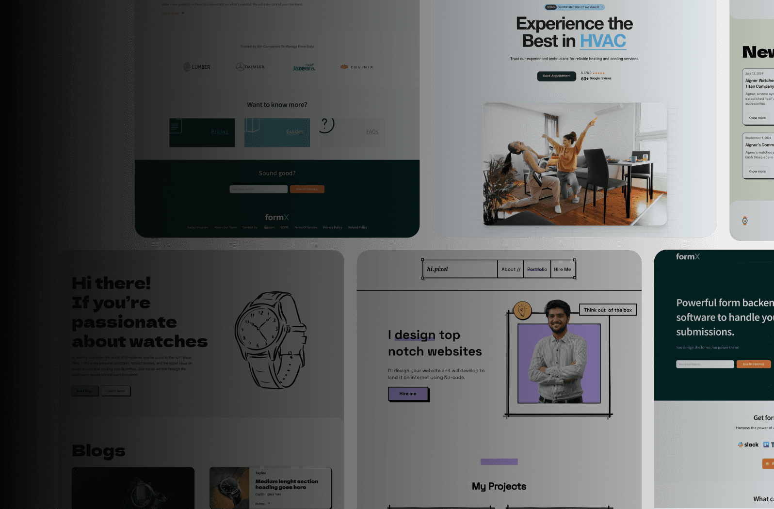
Testing Responsiveness
Framer makes it easy to preview and test your responsive designs:
Real-time previews: You can view how your layout responds to different screen sizes by resizing the canvas or using the built-in preview tools.
Device-specific testing: Framer allows you to see how your layout performs on different devices, ensuring your design works seamlessly across mobile, tablet, and desktop.
Best Practices for User Experience Design
Creating a responsive layout is just one aspect of designing a seamless user experience. To truly optimize your design, keep these UX best practices in mind:
Keep the user journey focused: Always design with the user’s needs in mind. Anticipate their pain points and design features that solve these problems.
Simplify navigation: A clear and intuitive navigation structure will make it easier for users to find what they’re looking for.
Test regularly: Continuously test your design on real users and devices to gather feedback and make necessary improvements.
Accessibility is key: Ensure that your design is accessible to all users, including those with disabilities.
Conclusion
Designing seamless user experiences with responsive layouts is critical for modern web development, and Framer offers the tools needed to achieve this with finesse. By utilizing grids, constraints, breakpoints, and testing features, you can create designs that adapt beautifully to any device.
Now that you’ve mastered the fundamentals of responsive layout design in Framer, it’s time to start creating. Whether you're a UX designer or a product manager, these techniques will help you elevate your projects and deliver exceptional user experiences. Dive into Framer’s features today and take your designs to the next level!
Ready to take your designs to the next level?
Learn how to design seamless user experiences with responsive layouts in Framer. This guide covers grids, breakpoints, and best practices to elevate your UX design. Perfect for UX designers, developers, and product managers.


Ready to elevate your website? Let’s bring your vision to life with Framer.