
Responsive Web Design: Transforming Indian Business Success
Responsive Web Design: Transforming Indian Business Success
May 13, 2025

The Responsive Revolution: Why India's Businesses Need It Now
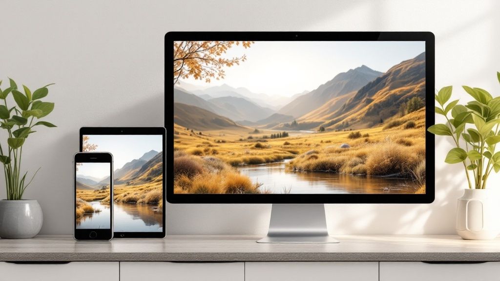
The way Indians access the internet is changing. Businesses need to keep up. Old-fashioned fixed-width websites are no longer effective. Today, responsive web design is essential. This design philosophy ensures your website looks great and works perfectly on any device, whether it's a smartphone, tablet, laptop, or desktop. This is especially critical in India, where mobile browsing is significantly more common than desktop use.
The Three Pillars of Responsive Design
Responsive web design relies on three key elements: fluid grids, flexible images, and media queries. Fluid grids allow elements on the page to resize proportionally to the screen's width. This prevents content from being cut off or requiring users to scroll horizontally.
Flexible images, as the name suggests, adjust their size automatically to fit their containers. This ensures images always display correctly, regardless of screen size. This is beneficial for user experience and especially helpful in India, where internet speeds can fluctuate.
Media queries are the driving force behind responsive design. They identify the user's device characteristics, such as screen size and orientation. Based on this information, they apply specific styling rules, creating the best possible layout for each device.
The SEO Advantage and User Experience Boost
Responsive design greatly impacts search engine rankings, a crucial factor for businesses in India. A responsive website can boost search engine results page (SERPs) rankings by as much as 20%. This is largely due to Google's focus on mobile-friendly websites, a policy adopted in 2015.
By 2025, it's projected that 90% of websites will be responsive. However, the current adoption rate in India presents an opportunity for local businesses to get ahead of the competition. For more insight into these statistics, check out this resource: Learn more about Indian website design statistics.
Beyond SEO, responsive design dramatically improves user experience. A website that adapts seamlessly to any device builds trust and encourages visitor interaction. This translates to longer visits, lower bounce rates, and higher conversion rates. In a mobile-first market like India, a smooth mobile experience is paramount.
Real-World Results in India
Leading Indian web developers are seeing firsthand how businesses that adopted responsive design early are thriving. Companies in various sectors, from e-commerce to finance, have reported significant improvements in key performance indicators after implementing responsive strategies.
These improvements lead to real business growth, including increased sales and stronger brand recognition. Responsive design is not just about aesthetics; it's a valuable investment for any Indian business looking to succeed in the current market.
Beyond Aesthetics: The Business Case for Responsive Design
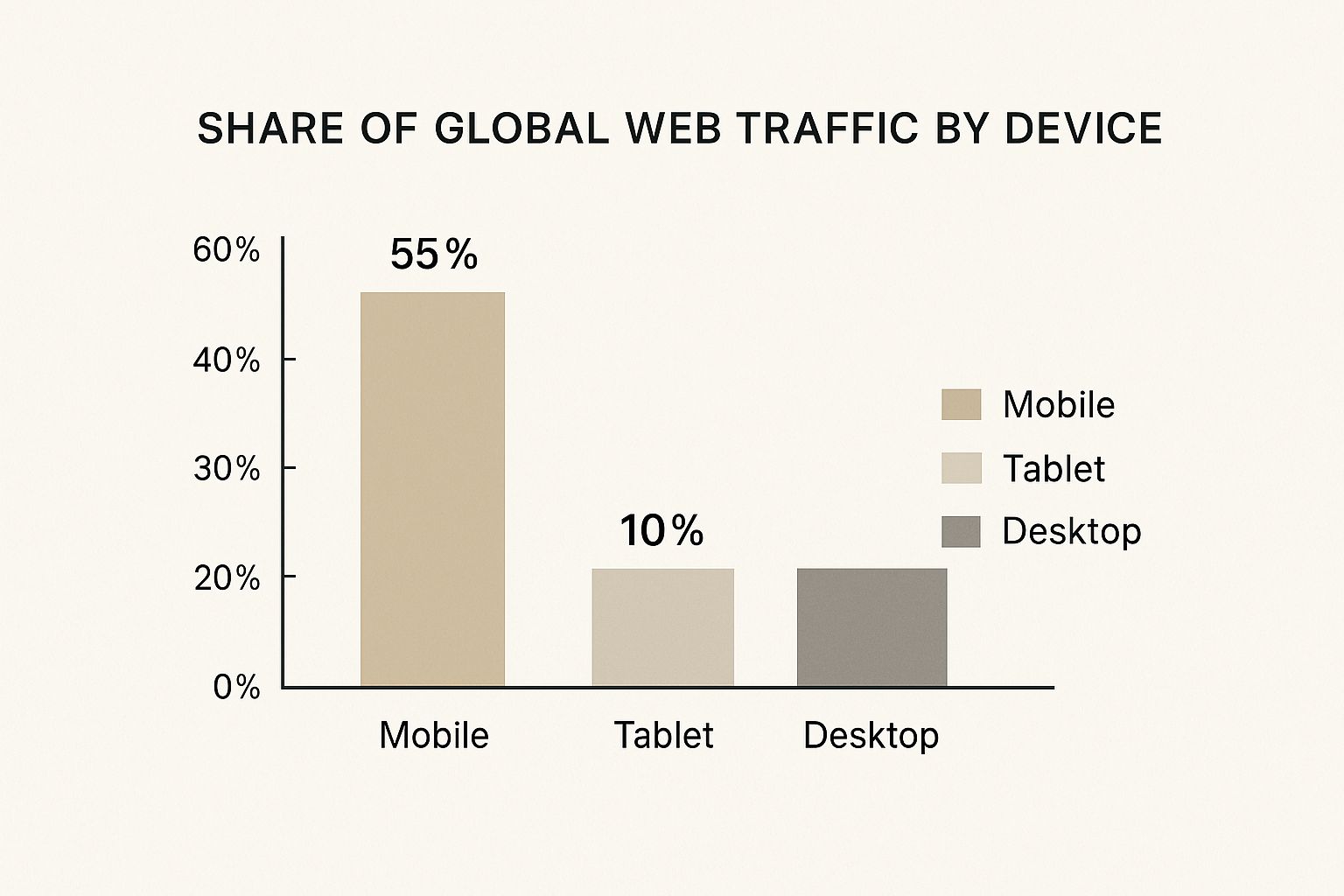
The chart above shows how global web traffic is spread across different devices. Mobile devices take the lead with 55% of all traffic, followed by desktops at 35% and tablets at 10%. This clearly shows how important mobile browsing is, and why responsive design is crucial for reaching today's online audience.
This change in how people access the internet has a big impact on Indian businesses. Ignoring responsive design isn't just about having a website that looks less appealing on a phone. It directly affects your profits. Let's look at the real impact responsive design has on key business metrics.
The Impact on Conversions and Bounce Rates
Think about this: in India, about 74% of users are more likely to return to a mobile-optimized site. This highlights how important responsive design is for user satisfaction and engagement. Explore this topic further.
Responsive design also directly impacts conversion rates. A website that's easy to use on any device encourages visitors to take action, like making a purchase or signing up for a newsletter.
Furthermore, responsive design can lower bounce rates. If a website isn't mobile-friendly, visitors are more likely to leave quickly. This can result in lost customers and hurt your search engine rankings.
Building Trust and Brand Perception
Brand perception is crucial in India's competitive market. A responsive website makes your business look professional and trustworthy. When a business invests in a positive user experience across all devices, it shows customers that they value their time. This builds trust and can create loyal customers.
Imagine a potential customer in Mumbai trying to access your website on their smartphone. A non-responsive site will likely frustrate them and create a negative brand impression. A seamless mobile experience, however, encourages interaction and builds a positive image.
Measuring the ROI of Responsive Design
You can see the return on investment (ROI) of responsive design in several ways. Higher conversion rates lead to more sales, and lower bounce rates improve search engine visibility.
Lower development costs are another plus. With a responsive approach, you only maintain one website instead of separate versions for different devices.
Sector-Specific Benefits Across the Indian Market
The benefits of responsive design span various industries in India. For e-commerce, a smooth mobile experience is key for capturing sales from a mostly mobile-first customer base. In the service sector, it ensures potential clients can easily find information on their phones.
Before we wrap up, let's look at the core differences between responsive and non-responsive websites and their impact on business metrics in India. The following table summarizes the key distinctions:
Responsive vs. Non-Responsive Websites: Business Impact
This table compares key business metrics between responsive and non-responsive websites in the Indian market.
Metric | Responsive Website | Non-Responsive Website | Percentage Difference |
Bounce Rate | Lower (e.g., 20%) | Higher (e.g., 60%) | -40% |
Conversion Rate | Higher (e.g., 5%) | Lower (e.g., 2%) | +3% |
Return Visits | Higher (e.g., 60%) | Lower (e.g., 30%) | +30% |
Mobile User Satisfaction | High | Low | Significant Improvement |
As you can see, responsive websites offer significant improvements across critical metrics. These improvements translate to tangible business benefits, including increased sales, improved customer loyalty, and a stronger brand presence.
Ultimately, responsive design is a smart investment for Indian businesses. By prioritizing user experience on all devices, businesses can build customer loyalty, improve brand perception, and boost their bottom line.
Mastering the Technical Elements That Drive Results
Effective responsive web design goes beyond mere visual appeal. It's about creating a user experience that feels seamless and intuitive across various devices, particularly in diverse markets like India. This involves understanding the core technical components that power responsive design.
Fluid Grids: Maintaining Proportion
Imagine a fluid grid as a flexible container. Instead of fixed pixel widths, elements are sized using percentages. This allows content to adapt smoothly to different screen sizes, preserving visual hierarchy. A sidebar might occupy 30% of a desktop screen and automatically adjust to a larger percentage on mobile.
Flexible Images: Adapting Beautifully
Images enhance web design, but they can also impact performance, especially on mobile devices with varying internet speeds, a common challenge in India. Flexible images dynamically scale to fit their containers. This prevents overflow and optimizes sizing, resulting in faster loading and smoother browsing.
Media Queries: Responding Intelligently
Media queries are the intelligence behind responsive design. They apply different styles based on device characteristics, such as screen size, resolution, and orientation. They can transform a horizontal desktop navigation bar into a compact mobile hamburger menu, optimizing the layout for each context. Check out our guide on How to master responsive layouts.
Touch-Friendly Navigation: Designing for Indian Users
Navigation is paramount for any website. In India, with its high mobile usage, touch-friendly navigation is essential. This means larger buttons, ample spacing between elements, and intuitive gestures. Many Indian users primarily interact via touch, so designs must accommodate this.
Consider the range of internet speeds and devices across India. A website performing well in a metro area might struggle elsewhere. Progressive enhancement, where core content loads first and additional features load as bandwidth allows, becomes vital. Website credibility is often judged on aesthetics, with 75% of judgments based on design.
The Indian market is embracing responsive design. With 90% of websites globally adopting it and 36% of designers using Figma (a popular design tool), Indian businesses must adapt. More statistics can be found here: https://blog.sagipl.com/web-design-statistics/. Focusing on these technical elements ensures a seamless experience for all users, leading to improved satisfaction, higher conversion rates, and ultimately, business success. You might be interested in: How to master responsive layouts in Framer.
Mobile-First: Why India Demands It and How to Deliver

In India, millions access the internet primarily through their smartphones. This makes mobile-first design essential for reaching this vast and growing audience. Prioritizing the mobile experience is key, designing for smaller screens first and then adapting for larger devices. This contrasts with the traditional desktop-first method and is crucial for engaging with India's mobile users.
Why Desktop-First Fails Indian Consumers
Traditional desktop-oriented websites often create a subpar experience on mobile. Navigation can be clunky, images may load slowly or incorrectly, and text can be difficult to read. This leads to user frustration and missed opportunities for businesses.
Imagine trying to navigate a complex menu on a small screen with a slow connection. This is a common scenario for many in India. A desktop-first site likely won't provide a positive experience in such situations.
Building From Mobile Upward: Content Prioritization
A mobile-first strategy begins by pinpointing the most crucial information for mobile users. What needs to be seen first? What actions should they be able to take easily? This content is prioritized and displayed clearly on the mobile site version.
Less important information might be placed lower or removed from the mobile version entirely. Long blog posts could be summarized, for example, with a link to the full article for those interested in reading more. Learn more in our article about mobile-first approaches for digital growth.
Performance Optimization for Varied Connection Speeds
Internet speeds vary significantly across India. While some regions have high-speed access, others rely on slower networks. This requires careful performance optimization. Images should be compressed for faster loading without compromising quality, and code should be streamlined.
Caching is another valuable technique. By storing frequently accessed data, websites can load significantly faster, even on slower connections. This boosts user experience and improves customer retention.
Interface Design for Diverse User Behaviors
India's mobile user base is incredibly diverse, with varying regions, languages, and tech proficiency. Interface design must accommodate these differences.
Consider the variety of input methods. Some prefer virtual keyboards, while others may use voice input. A well-designed mobile-first site caters to these variations.
Understanding Your Indian Audience Segments
To truly connect with your target audience in India, understand their needs and expectations. User research, including surveys and user testing, provides valuable insights.
This research can uncover key details, such as the types of devices used, peak online activity times, and the specific challenges users face when accessing the internet. This informs better design decisions, ensuring a positive user experience. A mobile-first approach ultimately builds stronger customer relationships, fosters loyalty, and drives growth in this vibrant market.
Testing Across India's Device Landscape: A Practical Guide
Creating a responsive website is only the beginning. Making sure it works perfectly across the wide variety of devices and network conditions found in India requires careful planning and testing. This section provides a practical guide for navigating this diverse digital environment.
Essential Testing Methodologies
Simply considering different screen sizes isn't enough. Cross-device testing is essential. This means checking your website's functionality, performance, and how it looks on a range of smartphones, tablets, and browsers popular in India.
Think about the differences between high-end smartphones used in cities and the simpler feature phones common in rural areas. Your website needs to adapt seamlessly to both.
Emulators and simulators are useful tools for initial testing. However, nothing replaces testing on real physical devices. This gives you the most accurate picture of how users will experience your website.
Affordable and Powerful Testing Tools
A wide selection of tools are available, from free browser developer tools to paid services like BrowserStack and LambdaTest. These platforms offer access to a large collection of real devices for testing across different operating systems and browsers. They can help identify performance issues, layout problems, and areas where usability could be improved. Choose tools that fit your budget and provide the features you need.
Optimizing Load Times for Variable Connections
India's internet infrastructure presents unique challenges. Connectivity can vary significantly, from high-speed fiber optic connections in cities to less reliable 2G connections in more remote areas. Your website must be able to handle this range of connectivity.
Optimizing images and cleaning up your site's code are crucial. Smaller image file sizes and streamlined code minimize loading times, even on slower networks. Prioritizing content for mobile users is also a key factor.
Learning From Success Stories
Take a look at how successful Indian businesses like Flipkart and Paytm approach responsive testing. Their websites perform well across a wide array of devices and network conditions.
By studying their strategies, you can gain valuable insights. What tools do they use? What testing protocols do they follow? Learning from the successes of others can inform your own testing procedures.
Building a Comprehensive Testing Protocol
A structured approach is essential. Develop a testing checklist specifically designed for the Indian market. This checklist should include the various devices, browsers, and connection speeds relevant to your target audience.
Regular testing is just as important as the initial tests. As your website changes and grows, new issues can appear. Ongoing testing helps maintain consistent performance and allows you to catch problems before they impact your users.
To assist with building a thorough testing strategy, we've provided a detailed checklist:
Responsive Design Testing Checklist for Indian Websites
A comprehensive checklist of devices, browsers, and testing criteria specifically relevant for the Indian market
Testing Category | What to Test | Common Issues | Resolution Approaches |
Device Compatibility | Screen sizes, resolutions, operating systems (Android, iOS) | Layout inconsistencies, broken functionality | Media queries adjustments, device-specific fixes |
Browser Compatibility | Chrome, Firefox, Opera Mini (popular in India) | Rendering differences, JavaScript errors | Cross-browser testing, browser-specific CSS |
Network Performance | Load times on 2G, 3G, 4G, and Wi-Fi | Slow loading, timeouts | Image optimization, code minification, caching |
Usability | Navigation, form interactions, touch responsiveness | Difficult navigation, unresponsive elements | User testing, design adjustments for touch interfaces |
Accessibility | Font sizes, color contrast | Readability issues for visually impaired users | Adherence to accessibility guidelines (WCAG) |
This table highlights the key aspects to consider when testing your website for the Indian market. By addressing these points, you can identify potential problems and implement effective solutions.
By following these guidelines and using the provided checklist, you can ensure your responsive website provides a positive user experience for everyone in India, regardless of their device or location. This thorough testing process will lead to increased user satisfaction, better engagement, and greater success in the Indian market.
Converting Browsers to Buyers: E-commerce That Performs
E-commerce success in India relies on delivering a mobile shopping experience that turns casual browsers into dedicated customers. This involves understanding the specific preferences and behaviors of Indian online shoppers and optimizing your responsive design accordingly.
Crafting Mobile Product Experiences That Inspire Confidence
Building trust is crucial for online sales. High-quality product images that load quickly, even with slower internet connections, are essential. Touch-friendly zoom features and 360-degree product views let customers examine products in detail, mimicking the experience of shopping in a physical store. Clear, concise product descriptions, tailored for the Indian consumer, further build confidence and encourage purchases.
Navigation: Guiding Users Effortlessly Toward Conversion
A smooth, intuitive navigation system is essential. A cluttered or confusing interface can lead to frustration and customers abandoning their shopping carts. Consider adding faceted search and filtering options to help users quickly locate what they need. Ensure the search bar is visible and easy to use on a mobile device.
Checkout Optimized for Indian Payment Preferences
The checkout process should be seamless and secure, supporting common Indian payment methods like UPI, net banking, and cash-on-delivery (COD). A complicated or time-consuming checkout process can result in lost sales. Offering a guest checkout option minimizes friction for first-time buyers. Display security badges and trust signals prominently to reassure customers about the safety of their transactions. You might be interested in: How to master landing page best practices.
Reducing Abandonment Rates Through Localized Strategies
Understanding regional shopping habits is key. Offering regional language options can greatly improve the experience for non-English speakers. Displaying product prices in INR and providing accurate delivery time estimates are crucial for building trust and managing expectations.
Building Trust Signals That Resonate With Indian Consumers
Displaying customer testimonials and reviews can establish credibility and encourage conversions. Highlighting secure payment gateways and clear return policies builds trust. Featuring certifications from recognized Indian organizations further strengthens credibility.
Image Optimization: Balancing Visual Appeal With Load Times
Product images are essential to online shopping, but large image files can slow down page loading, particularly on mobile. Optimizing images for the web without sacrificing quality is critical. Techniques like image compression and using the WebP file format can significantly boost performance.
Implementing Touch-Friendly Product Interfaces
Designing for touch interactions is crucial. Product galleries should be easy to navigate with swiping gestures, and buttons should be large enough for comfortable tapping on smaller screens. Keep the thumb zone principle in mind, positioning important interactive elements within easy reach of the user's thumb.
Streamlined Purchasing Journeys Across Devices
The entire buying process, from discovery to order confirmation, should be consistent across all devices. This means maintaining consistent branding, messaging, and functionality whether a customer is using a smartphone, tablet, or desktop computer. A disjointed experience can lead to confusion and lost sales. By implementing these strategies, e-commerce businesses can build a user-friendly mobile experience catering to the unique requirements of Indian shoppers. This leads to higher conversion rates, lower cart abandonment, and ultimately, a thriving online business.
Future-Proofing Your Responsive Strategy
Building a responsive website isn't a one-time project; it's an ongoing commitment. The digital world is constantly evolving, with new technologies and user behaviors emerging regularly. Your responsive strategy needs to adapt to stay effective. This section explores how to prepare your website for the future, ensuring a solid foundation that can handle change.
Emerging Trends Reshaping Responsive Design in India
Several key trends are changing how people in India interact with the web. Progressive Web Apps (PWAs), blending the best of websites and mobile apps, are gaining traction, particularly in areas with limited bandwidth. PWAs offer a fast, reliable experience even with spotty internet connections, a significant benefit in a market like India.
Another important development is the rise of voice interfaces. With a large portion of the Indian population having limited literacy, voice search provides an accessible way to browse the internet. Optimizing your website for voice search will become increasingly crucial.
Separating Hype from Reality: Which Innovations Matter?
Not every new technology deserves your investment. While some, like PWAs, offer clear advantages, others might be more hype than substance. It's essential to critically evaluate new trends and determine their relevance to your specific Indian target audience.
For example, the growing use of foldable devices presents new design challenges. While still a niche market, screens that shift size and orientation require careful thought regarding content adaptation. Assess the potential impact of each innovation and focus on those most likely to benefit your business and user experience.
Changing User Behaviors: Foldable Devices and Smart Displays
Beyond foldable devices, smart displays are also becoming more prevalent in Indian homes. These voice-activated devices create different user behavior patterns than traditional smartphones or desktops. Responsive design must accommodate both traditional and emerging interactions.
Consider how users interact with a smart display. They're often used hands-free for quick information or simple tasks. Your website design should reflect this, offering concise information easily digestible through voice interaction or a quick glance.
Insights from Indian Developers and Business Leaders
Connecting with Indian developers and business leaders provides invaluable real-world perspectives. They are at the forefront of these changes, directly witnessing how new technologies affect user behavior and business results.
Their insights offer a practical understanding of which innovations deliver tangible results and which are likely to fade. This knowledge can inform your responsive strategy, guiding you to make smart investments in technologies that will drive future growth.
Building a Framework for Evaluating New Approaches
A structured approach is key for evaluating and implementing new technologies. Consider this framework:
Relevance: Does the technology address the needs of your Indian target audience?
Impact: What measurable impact will it have on your business goals?
Feasibility: Can you implement it within your budget and timeline?
Scalability: Can the technology scale as your business grows?
By using this framework, you can prioritize innovations aligned with your objectives and offering the highest growth potential. This ensures wise investment in future-proofing your responsive web design strategy.
To build a truly responsive and future-ready website for your business in India, consider partnering with Framerry. We specialize in creating stunning, high-performance websites using Framer's advanced toolkit. Learn more about how Framerry can help you succeed.
Ready to take your animations to the next level?
Discover how responsive web design propels Indian businesses forward with mobile-optimized experiences that boost SEO, engagement, and conversions.


Ready to elevate your website? Let’s bring your vision to life with Framer.