
Website Design Tips: Create Engaging Digital Experiences
Website Design Tips: Create Engaging Digital Experiences
May 12, 2025

Website Design Tips: Create Engaging Digital Experiences
The Evolution of Website Design: From Basic to Brilliant

Early websites were simple creations. Built with HTML, they resembled online brochures—informative, yet static. This transition from static content to dynamic experiences is key to understanding how website design has changed. Think about it: early websites primarily displayed information. Modern websites, however, prioritize user engagement and conversion.
This shift reflects how internet usage has transformed, moving from passive consumption to active participation. Users now expect more than just information; they want interaction.
The Rise of User-Centric Design
As internet usage grew, so did user expectations. Websites were no longer evaluated solely on their visual appeal. Functionality, usability, and accessibility became paramount. This shift marked the rise of user-centric design. Websites now revolve around the needs and preferences of their users.
This means website design is about crafting experiences that are not only visually appealing but also intuitive and easy to navigate. A good user experience is now a critical factor in a website's success.
Minimalism, Accessibility, and Mobile-First in India
The trend towards minimalist web design is especially noticeable in India. Clean layouts and improved load times are highly valued. In fact, it's projected that roughly 60% of Indian websites will adopt minimalism by 2025.
Furthermore, 80% of Indian businesses now consider accessibility a core element of their website design strategy. This involves optimizing websites for users with disabilities, broadening reach, and adhering to web standards. These changes reflect a broader digital shift in India, fueled by a rapidly growing user base demanding faster, more user-friendly mobile websites.
This focus on mobile-first design acknowledges India's significant mobile user base. It directly impacts user engagement and conversions. Learn more about successful website design trends in India here. This evolution highlights the importance of website design in meeting the demands of a growing digital marketplace.
The Future of Website Design in India
Website design continues to evolve, particularly in a dynamic digital landscape like India's. With the increasing importance of mobile and the emergence of new technologies like AI, website design must adapt.
Businesses and website designers need to stay current with the latest trends and technologies. This is essential for creating effective and engaging online experiences for Indian users. Ultimately, successful website design creates a seamless, intuitive, and engaging experience. One that connects with users and drives business results.
Core Principles That Separate Winning Websites From Failures
A website isn't just an online placeholder; it's the digital storefront of your business. In India's competitive online market, a well-designed website is essential for attracting customers and fostering growth. But what distinguishes a successful website from a failing one? It comes down to core design principles that prioritize the user experience and effectively convey your brand's message.
Visual Hierarchy: Guiding the User's Eye
Visual hierarchy arranges elements on a page to direct the user's attention. Think of it like a well-organized store: important products are prominently displayed at eye level. Similarly, website elements like headings, images, and call-to-action buttons should be positioned to highlight the most crucial information first.
This ensures visitors quickly grasp key messages and navigate intuitively. For instance, using larger fonts for headings and contrasting colors for important buttons can effectively guide users.
Whitespace: Breathing Room for Clarity
Whitespace, also called negative space, is the empty area between elements. While it might seem unproductive, whitespace is essential. It provides visual breathing room, making content easier to read and preventing a cluttered feel.
Think of a crowded street versus a spacious park. The park's open areas allow you to appreciate its beauty and navigate easily. Similarly, adequate whitespace on a website improves readability and focuses attention. This is especially vital in India, where many users access websites on mobile devices.
Navigation Consistency: Building Trust and Confidence
Consistent navigation is key for a positive user experience. A clear, predictable navigation structure allows users to find what they need, building trust in your brand. Just as landmarks help navigate a city, consistent website navigation builds user confidence.
This involves using consistent terminology, placement, and styling throughout the site. Inconsistent or difficult-to-find navigation can frustrate users and lead them to leave. You might find this helpful: How to master expert website design for your small business.
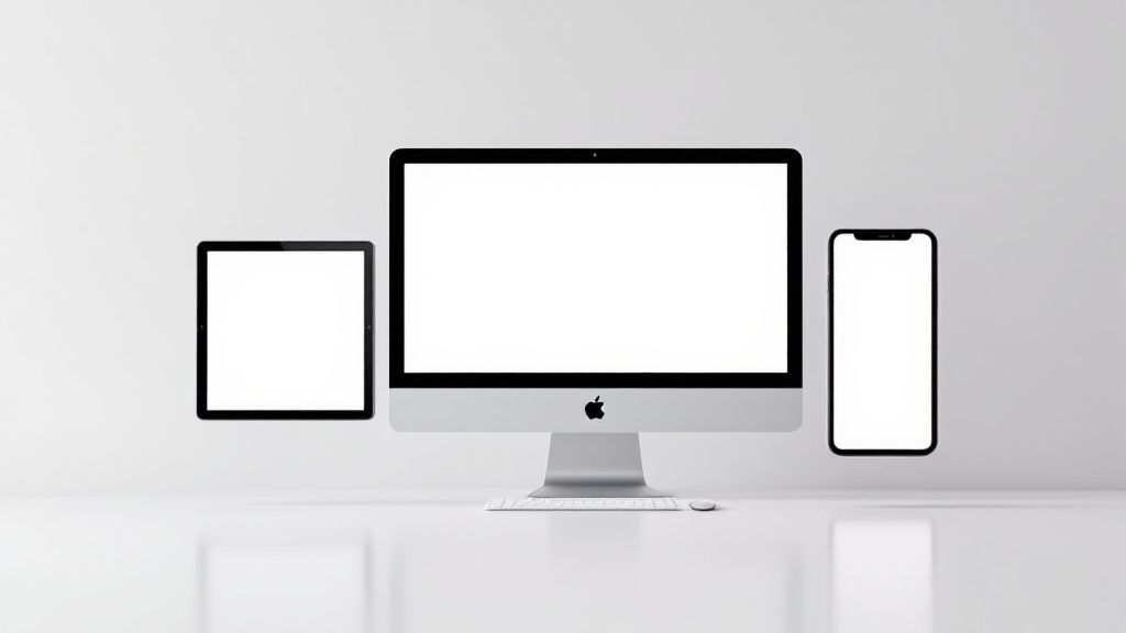
Responsive Design: Adapting to Every Screen
In India's mobile-first environment, responsive design is vital. A responsive website seamlessly adapts to different screen sizes, from desktops to smartphones, ensuring a consistent experience.
This means images resize dynamically, text reflows smoothly, and the layout adjusts accordingly. Without responsive design, your website might appear distorted or be difficult to use on smaller screens, potentially losing customers.
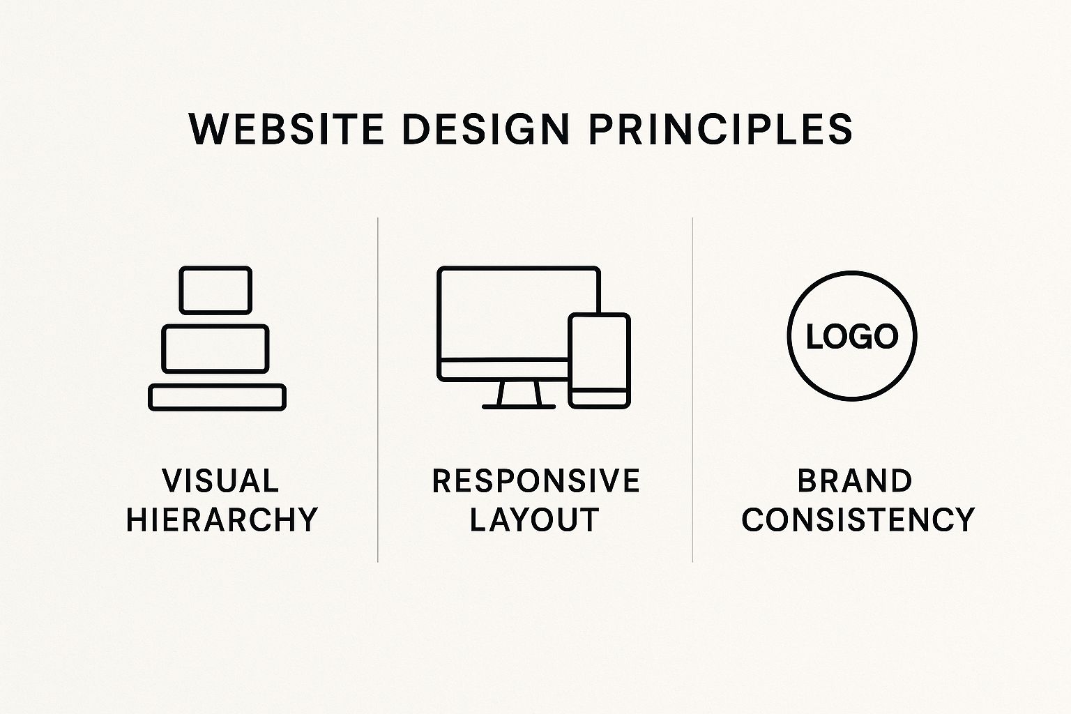
The infographic above illustrates the core principles of Visual Hierarchy, Responsive Layout, and Brand Consistency. These elements are crucial for a user-friendly and effective website. They provide a clear path to information, adapt to different devices, and reinforce brand identity, leading to a positive user experience.
Brand Consistency: Reinforcing Your Identity
Brand consistency is essential for building recognition and trust. Your website should reflect your brand's visual identity, using consistent colors, fonts, and imagery. A recognizable logo helps customers identify your business offline, and consistent online branding strengthens your web presence. This creates a memorable impression and reinforces your message.
To further illustrate these principles, let's explore them in a table format:
Essential Website Design Principles: A comparison of key design principles and their impact on user experience and business outcomes
Design Principle | Purpose | Business Impact | Implementation Example |
Visual Hierarchy | Guide user attention to key information | Improved user engagement, higher conversion rates | Larger fonts for headings, contrasting colors for call-to-action buttons |
Whitespace | Create visual breathing room and improve readability | Reduced bounce rate, enhanced user satisfaction | Ample spacing between elements, clear visual separation of content blocks |
Navigation Consistency | Facilitate easy navigation and build user trust | Increased user retention, improved brand loyalty | Consistent menu placement and terminology across all website pages |
Responsive Design | Ensure optimal viewing experience across all devices | Wider audience reach, enhanced mobile user experience | Fluid layouts, flexible images, and media queries |
Brand Consistency | Reinforce brand identity and build recognition | Improved brand recall, stronger customer trust | Consistent use of brand colors, fonts, and imagery across the website |
This table summarizes how each principle contributes to a better user experience and positive business outcomes. By focusing on these fundamentals, you can create a website that not only looks good but also effectively serves your business goals.
These core design principles form the foundation of effective web design. By thoughtfully implementing them, you create a website that not only looks good but also performs well, attracting customers, driving conversions, and building a strong online presence within India's dynamic digital market.
Mobile-First Website Design: Beyond Responsive Layouts
Mobile devices are now the primary way people in India access the internet. This requires a shift in how we approach website design, prioritizing the mobile experience from the ground up. It's not just about responsive design; it's about a mobile-first mindset.
Why "Mobile-First" Matters in India
Mobile web browsing dominates in India. Over 75% of Indians prefer mobile devices for internet access, making a mobile-first approach crucial for businesses targeting the IN region. This impacts user engagement, search rankings, and ultimately, profits. Websites need to load quickly, offer easy navigation, and provide quick access to information, especially since slow sites drive away almost 39% of users globally. Find more detailed statistics here.
This mobile-centric environment also fuels India's booming e-commerce and social media usage. Effective mobile website design is key for success in India's digital economy. You might be interested in: How to master the mobile-first approach.
Optimizing Touch Interactions
Mobile users interact with websites using their fingers, not a mouse. Buttons and links need to be large enough for comfortable tapping. Consider average finger size and element spacing to avoid accidental clicks.
Intuitive integration of gestures like swiping and pinching also enhances user experience and engagement. Think about how users naturally interact with their phones and design accordingly.
Improving Mobile Load Performance
Speed is paramount on mobile. Users expect near-instant loading. Optimize images, minimize HTTP requests, and use a Content Delivery Network (CDN) to reduce latency. This is especially critical in India, where network connectivity can vary.
A faster site improves user experience and boosts search engine rankings. Every second counts when it comes to keeping users engaged on your mobile site.
Designing Effective Mobile Navigation
Navigation on a smaller screen presents unique challenges. A simple, intuitive menu is essential. Consider a hamburger menu to consolidate options.
Prioritize the most important pages for easy access. This ensures users find what they need quickly and efficiently, improving their overall experience.
Turning Mobile Constraints Into Opportunities
Limited mobile screen space can be an advantage. It forces designers to focus on essential content and streamline the user journey.
This focused approach can lead to more impactful messaging and increased conversion rates. By prioritizing key information, a more effective mobile experience emerges.
Identifying and Addressing Mobile Pain Points
Understanding mobile user frustrations is crucial. Analyze user behavior to identify common pain points. Are users abandoning pages at a specific point? Are they struggling with certain actions?
Addressing these issues can significantly improve user satisfaction and conversion rates. Focus on making the user experience as smooth and frustration-free as possible.
Case Study: Successful Mobile-First Design in India
Many Indian businesses have seen impressive results with mobile-first design. E-commerce platforms like Flipkart and Myntra have prioritized mobile optimization, resulting in increased sales and user engagement. Their websites load quickly, offer intuitive navigation, and provide seamless mobile checkout experiences.
This demonstrates the power of a well-executed mobile-first strategy in India. These companies serve as strong examples of how to effectively prioritize the mobile user.
By focusing on these principles, businesses can create mobile-first websites that cater to the Indian market and provide a superior user experience, ultimately driving engagement and achieving business objectives. This is a necessity for success in today’s mobile-dominated world.
Psychological Triggers in Website Design That Drive Action

Effective website design isn't just about creating a visually appealing site. It's about understanding what makes visitors engage, explore, and ultimately, take action. This involves delving into the psychology of user behavior online. This section explores the psychological principles that drive impactful website design, and how you can use them to create a more engaging user experience.
The Power of Color Psychology
Color has a profound impact on our emotions and decisions. In website design, the right color palette can evoke specific feelings and influence user actions. For instance, blue is often associated with trust and reliability, making it a common choice for financial institutions like Chase. Green, on the other hand, often represents growth and nature, a favorite of environmentally conscious brands.
Understanding these color associations is crucial for effective website design. The colors you choose subconsciously influence how users perceive your brand and interact with your site. Consider your target audience and the message you want to convey when selecting your color scheme.
Microinteractions: Small Details, Big Impact
Microinteractions are subtle animations or feedback mechanisms that enhance the user experience. These small details, such as a button changing color when clicked or a loading animation, add a sense of interactivity and engagement. They provide confirmation of user actions, making the website feel more responsive.
Think of it like the satisfying click of a light switch. It confirms the action. Similarly, microinteractions on a website create a more interactive and engaging experience. These subtle cues enhance the overall user experience and make the site feel more dynamic.
Page Layout and Cognitive Flow
How you present information on a webpage significantly impacts user understanding. Organizing content logically, using clear headings, bullet points, and incorporating visual hierarchy principles guides users through the information naturally.
This structured approach improves comprehension and reduces cognitive load. A well-structured layout makes it easier for users to find information and take action. Just like a well-organized presentation, a clear page layout makes your website more user-friendly.
Reducing Friction Points: Smooth User Journeys
Friction points, any element that hinders a user’s progress, can significantly impact conversion rates. These can range from complicated forms and slow loading times to unclear navigation. Minimizing these frustrations is crucial for a positive user experience.
For example, streamlining the checkout process with fewer steps can significantly increase sales on e-commerce platforms like Shopify. A smooth user journey is essential for encouraging desired actions and maximizing conversions.
Testing and Optimization: A Data-Driven Approach
Applying psychological principles is an ongoing process. Regularly testing and optimizing your website based on user data ensures your strategies are effective. A/B testing can help determine which design elements perform best. Analyzing metrics like bounce rate and time spent on page can pinpoint areas for improvement.
This data-driven approach eliminates guesswork. Real insights help you create a more effective and user-friendly website, constantly refining your design based on how real users interact with your site.
To further illustrate how these principles can be measured and improved, consider the following table:
UX Design Metrics and Benchmarks Key performance indicators for measuring website user experience effectiveness
Metric | Industry Benchmark | Measurement Method | Improvement Strategy |
Bounce Rate | <40% | Improve page load speed, clarity of content, and navigation | |
Time on Page | 2-3 minutes | Google Analytics | Engaging content, clear calls to action, internal linking |
Conversion Rate | 2-5% | Google Analytics, specific platform tools | Streamlined checkout process, compelling offers, clear value proposition |
Customer Satisfaction (CSAT) | >4 out of 5 | Surveys, feedback forms | Address user pain points, improve customer support, personalize the experience |
This table highlights key metrics and benchmarks to guide your optimization efforts. By tracking these metrics, you can identify areas for improvement and create a more user-centered website.
By understanding and implementing these psychological triggers, you can design a website that not only attracts visitors but also guides them toward desired actions. This creates a more engaging and ultimately more successful online experience.
Designing for Conversion: Elements That Turn Visitors Into Customers
A beautiful website is only part of the equation. The real measure of success lies in its ability to convert visitors into customers. This section explores the key design elements that facilitate this process, turning casual browsers into engaged buyers.
The Importance of Clear Calls to Action
Calls to action (CTAs) are essential for guiding users toward desired actions on your website. A well-designed CTA is clear, concise, and visually appealing. They serve as clear directions, leading visitors down the path to conversion.
Instead of a generic "Submit" button, opt for action-oriented language like "Get a Free Quote" or "Download Now." The wording you choose directly impacts user response. This small change can lead to a noticeable improvement in conversion rates.
Optimizing Form Design for Conversions
Forms play a vital role in capturing leads and gathering valuable information. However, lengthy or complicated forms can discourage users. Keeping forms short and focused is key to a positive user experience.
Consider using progressive disclosure, revealing form fields gradually. This prevents overwhelming visitors and simplifies the process, increasing completion rates. A well-structured form, much like a clear questionnaire, encourages responses.
Leveraging Social Proof to Build Trust
Social proof is a potent tool for influencing user behavior. Testimonials, reviews, and case studies can substantially boost credibility and encourage conversions. These elements demonstrate the value of your product or service through real-world experiences.
Displaying social proof prominently on your website builds trust with potential customers. It's like word-of-mouth marketing in a digital format. This validation can sway hesitant visitors and contribute significantly to conversions.
Using Visual Cues to Guide User Behavior
Visual cues, like arrows, lines, and contrasting colors, can subtly guide users toward important elements. These cues act as gentle nudges, directing attention and promoting desired actions. Think of them as silent guides on your webpage.
For example, highlighting a CTA button with a contrasting color can boost click-through rates. Visual cues can subtly influence user behavior, helping visitors navigate your site efficiently.
Prioritizing High-Impact Design Changes
Not all design changes are equally effective. Some have a greater influence on conversion rates than others. Focusing on the most impactful changes first is crucial for optimizing your website's performance.
Start by identifying key areas for improvement using data analysis and user testing. This data-driven approach helps prioritize changes that will generate the most significant results. You can find more valuable information on this topic in this article: How to master landing page best practices to boost conversions.
A/B Testing for Continuous Improvement
A/B testing is an invaluable tool for optimizing website design. By comparing different versions of a webpage, you can identify which elements perform best. This method provides data-backed insights for informed design decisions.
Testing various CTAs, form layouts, and visual cues reveals valuable information about user behavior. This iterative testing and refinement process ensures your website stays optimized for conversions. It's a continuous improvement cycle.
Creating Natural Conversion Funnels
A conversion funnel is the journey a user takes to complete a desired action. A well-designed funnel guides users seamlessly through each step, strategically placing CTAs and creating a smooth flow from initial contact to final conversion.
Think of it as a guided tour of your website. A smooth and intuitive funnel encourages users to progress through the conversion process.
By implementing these strategies and consistently refining your approach based on data and feedback, you can transform your website into a powerful engine for customer acquisition and business growth. This ongoing optimization process is essential for converting visitors into loyal customers.
Content and Visual Harmony: Creating Cohesive Experiences
Effective website design goes beyond mere aesthetics. It involves crafting a seamless fusion of content and visuals that narrates a compelling story and resonates with your target audience, particularly within the diverse Indian market. This harmony between form and function distinguishes a visually appealing website from one that genuinely engages users and achieves business goals.
The Interplay of Content and Visuals
Content and visuals should work together, each element strengthening the other. Imagine a perfectly synchronized dance: the visuals set the scene and attract the eye, while the content delivers the message and guides the narrative. This cohesive approach ensures your website not only looks good but also effectively communicates your brand's value.
For example, a website for a yoga studio in India could use calming imagery of asanas and peaceful landscapes paired with informative content about yoga practices. This creates a cohesive and welcoming online experience. This synergy is crucial for captivating your audience.
Typography: Enhancing Readability and Brand Identity
Typography plays a vital role in website design. It's more than selecting attractive fonts; it's about choosing typefaces that improve readability and reflect your brand's personality. Think of typography as your website's voice: it communicates volumes about your brand.
A traditional Indian restaurant might select elegant, serif fonts to convey authenticity and heritage. A tech startup, however, might opt for modern, sans-serif fonts to project a forward-thinking image. The right typography sets the tone and enhances the user experience.
Visual Hierarchy: Guiding Attention to Key Content
Visual hierarchy helps users quickly understand key information. Strategically placing elements like headings, images, and calls to action guides visitors through your website. It's like creating a roadmap, making it easier for users to navigate and find what they need.
Using larger fonts for headings and contrasting colors for important buttons can effectively direct attention to crucial elements. Effective use of whitespace further enhances this hierarchy, providing visual breaks and creating a sense of order.
Image Selection: Reinforcing Your Message
Images should enhance your content, not detract from it. Choosing relevant, high-quality images that complement your message is crucial. Think of images as visual storytelling tools, reinforcing your brand narrative and connecting with your audience emotionally.
For instance, a travel website targeting Indian travelers might feature stunning images of iconic landmarks like the Taj Mahal or the Himalayas, inspiring a sense of wanderlust. These visuals, combined with compelling descriptions, create a powerful and persuasive online experience.
Aligning Design Decisions With Content Goals
Every design choice should support your overall content strategy. Before making visual decisions, consider how each element contributes to your core message. This strategic approach ensures every aspect of your website design works together to achieve your communication goals.
For example, if your goal is to increase conversions, elements like clear calls to action, easy-to-navigate forms, and compelling product imagery become essential. These design decisions, aligned with your content goals, create a more effective and user-focused experience.
Creating Cohesive Digital Experiences: A Framework
Here’s a simple framework for creating a cohesive digital experience:
Define Your Brand: Understand your brand identity and values.
Develop a Content Strategy: Determine the message you want to communicate.
Choose Visual Elements: Select images, fonts, and colors that align with your brand and content strategy.
Establish Visual Hierarchy: Guide user attention to key information.
Ensure Mobile Responsiveness: Create a seamless experience across devices.
Test and Iterate: Regularly evaluate and refine your design based on user feedback.
By applying this framework, you can create a website where visuals and messaging work in harmony, delivering a memorable and effective digital experience that resonates with your target audience in India and beyond.
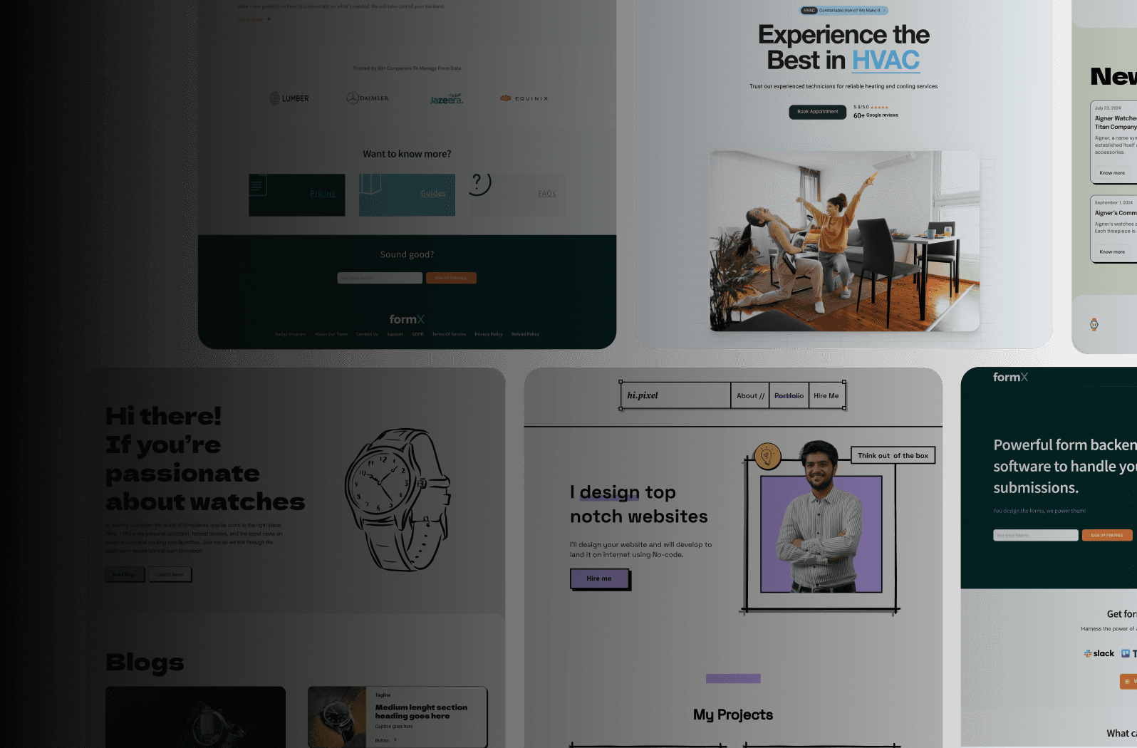
From Concept to Reality: Implementing Effective Website Design
A stunning website design is only the beginning. The real work lies in bringing that vision to life. This section offers a practical guide to implementing your website design, emphasizing efficient workflows and preserving your design's integrity throughout the development process.
Choosing the Right Development Approach
Choosing the right development approach is crucial for successfully implementing your design. Factors like budget, timeline, and technical needs all play a role in this decision. Consider these options:
DIY Platforms: Services like Wix and Squarespace offer user-friendly interfaces and templates, perfect for those with limited technical skills. However, these platforms can sometimes restrict customization and flexibility.
Content Management Systems (CMS): Platforms like WordPress offer greater control over design and functionality. They often require some technical knowledge or the help of a developer.
Custom Development: This option offers maximum flexibility and control, allowing for truly unique websites. However, custom development typically involves higher costs and longer timelines.
For businesses in India seeking fast, high-performing websites, Framer-focused services like Framerry offer a compelling solution. They combine the speed of DIY platforms with the flexibility of custom development.
Managing Stakeholder Expectations
Effective communication is essential throughout the implementation process. Regular updates and open discussions with clients or stakeholders help manage expectations and keep everyone on the same page.
Clearly defining roles and responsibilities from the start prevents confusion and promotes collaboration. This clarity is key for a smooth and efficient workflow.
Maintaining Design Integrity During Technical Implementation
The initial design vision should guide the entire development process. Close collaboration between designers and developers is essential for maintaining design integrity.
Regularly reviewing the development progress against the original design specs ensures the final product aligns with the initial vision. This ongoing review process is vital for preserving the design's core elements.
Effective Designer-Developer Collaboration
A strong partnership between designers and developers is the foundation of successful website design implementation. Open communication channels and mutual respect foster a productive working relationship.
Using collaborative tools, such as Figma or Adobe XD, facilitates seamless communication and ensures design specifications are clearly communicated to developers. This shared understanding minimizes misunderstandings and streamlines the development process.
Quality Assurance: Catching Issues Early
Thorough testing before launch is critical for identifying and fixing any technical or design flaws. A robust quality assurance (QA) process catches these issues before they impact your users.
Testing across different devices and browsers ensures a consistent user experience for everyone, no matter how they access your website. This comprehensive testing approach guarantees a smooth user journey across all platforms.
Post-Launch Optimization
Website design is an ongoing process. Continuous monitoring and optimization after launch are crucial for maintaining performance and meeting evolving user needs.
Analyzing user behavior data with tools like Google Analytics helps identify areas for improvement. This data-driven approach ensures your website stays relevant and user-friendly.
Adapting to Changing Digital Landscapes
The online world is constantly changing. Staying up-to-date with the latest design trends and technologies ensures your website remains competitive.
Being open to periodically updating your website design is crucial for staying ahead of the curve and providing users with a modern, engaging experience. This adaptability is essential for long-term online success.
By focusing on these implementation strategies, you can ensure your website design vision translates into a functional, user-friendly, and high-performing website that effectively serves your business objectives. Careful planning and meticulous execution are key for a successful website design project.
Are you ready to transform your online presence? Framerry offers rapid website design and development using Framer's powerful toolkit. Build your dream website in days, not weeks, with Framerry.
Ready to take your animations to the next level?
Learn top website design strategies to boost engagement and conversions. Master techniques for creating impactful digital experiences that attract visitors.


Ready to elevate your website? Let’s bring your vision to life with Framer.