
Top Portfolio Website Inspiration Ideas to Spark Creativity
Top Portfolio Website Inspiration Ideas to Spark Creativity
May 1, 2025

Unleash Your Creative Potential
Need portfolio website inspiration? This list showcases 7 exceptional portfolios to ignite your creativity. Discover how designers and developers like Daniel Korpai, Robby Leonardi, and Jessica Hische effectively present their work online. From minimalist designs to interactive storytelling and video backgrounds, explore diverse approaches to building an impactful online presence. Find the perfect portfolio website inspiration to showcase your unique skills and attract clients.
1. Minimal Portfolio by Daniel Korpai
Seeking portfolio website inspiration? Look no further than Daniel Korpai's striking online presence. This portfolio exemplifies minimalist design, effectively showcasing his work as a designer and developer. The site utilizes a clean, white background, carefully chosen typography, and ample negative space, allowing his projects to take center stage without unnecessary distractions. Korpai's portfolio demonstrates how simplicity can create a powerful impact and improve user experience by focusing on what matters most—the work itself. This approach is especially effective for showcasing high-quality visuals, making it an excellent choice for photographers, designers, and other visual artists.

This minimalist approach is built around several key features: a predominantly black and white design scheme, a card-based project layout organized within a responsive grid system, subtle hover animations that add a touch of interactivity, and a whitespace-focused layout that gives each element room to breathe. The result is a website that is both visually appealing and highly functional. The clean presentation emphasizes the quality of the work, while the fast loading time and easy navigation contribute to a seamless and distraction-free viewing experience across all devices, a crucial factor for users in the IN region and globally.
This style, reminiscent of Apple's design aesthetics and influenced by Scandinavian design principles, prioritizes clarity and functionality. Korpai's portfolio (danielkorpai.com) features case studies of UX/UI projects, demonstrating how this minimalist approach can effectively present complex projects in a digestible format.
Pros:
Clean presentation that emphasizes work: The minimalist design directs attention to the portfolio content.
Fast loading time: The streamlined design contributes to optimal performance, particularly beneficial in regions with varying internet speeds like the IN region.
Easy navigation: The simple layout makes it easy for visitors to browse projects.
Distraction-free viewing experience: The absence of clutter allows for focused appreciation of the work.
Works well across all devices: The responsive design ensures a consistent experience on desktops, tablets, and smartphones.
Cons:
Might feel too simple for some industries: Industries that rely on vibrant visuals or complex messaging might find this style too restrictive.
Limited color expression: The limited color palette might not be suitable for brands with strong color associations.
Requires high-quality project images to be effective: The minimalist approach relies heavily on strong visuals to carry the design.
Tips for Implementing a Minimalist Portfolio:
Use high-contrast images for best results: Maximize visual impact with striking imagery.
Limit your color palette to 2-3 colors: Maintain a clean and cohesive aesthetic.
Focus on typography hierarchy: Guide the user's eye with clear and consistent typography.
Ensure ample whitespace around elements: Give each element breathing room for a less cluttered look.
Use subtle animations to guide attention: Subtly draw attention to key elements and interactions.
This minimalist approach is particularly well-suited for startups, entrepreneurs, small and medium-sized businesses, and e-commerce platforms looking for a clean, fast-loading, and effective way to showcase their products or services online. Digital agencies and marketing firms can also leverage this style to create a professional and modern online presence. Web designers and developers looking for portfolio website inspiration can learn valuable lessons from Daniel Korpai's effective implementation of minimalist design principles. This example deserves its place on this list because it provides a clear blueprint for achieving a powerful online presence through simplicity and strategic design.
2. Interactive Storytelling Portfolio by Robby Leonardi
Robby Leonardi's portfolio stands as a prime example of innovative portfolio website inspiration, transforming the traditional resume into a captivating interactive experience. This approach leverages a side-scrolling, game-inspired format, reminiscent of classic platformers like Super Mario, to guide visitors through Leonardi's skills, experience, and projects. Instead of simply listing accomplishments, the portfolio becomes an engaging journey, allowing potential clients or employers to actively explore his capabilities in a fun and memorable way. This method effectively blends technical prowess with creative storytelling, making a strong statement about Leonardi's abilities.

This interactive storytelling approach offers several key features: a side-scrolling game interface, character-based navigation, rich animations, gamified presentation of skills and projects, and even an integrated contact form within the game environment. This gamification isn't just for show; it allows Leonardi to demonstrate his coding skills and creative thinking simultaneously. His portfolio has deservedly won numerous design awards, including FWA, and has been featured in multiple design publications, cementing its status as a benchmark for interactive portfolio design. You can experience it yourself at rleonardi.com/interactive-resume.
Pros: This style of portfolio is highly memorable and engaging, demonstrably showcases technical and creative abilities, makes you stand out from the crowd, injects personality and playfulness into your presentation, and effectively communicates skills through visual metaphors.
Cons: Developing such a portfolio is resource-intensive and requires significant development expertise. It may not be suitable for all industries (e.g., highly corporate sectors). It could be perceived as gimmicky by some clients, and maintaining and updating it regularly can be challenging. Furthermore, the resource-intensive nature can lead to longer loading times.
Tips for Implementation:
Ensure clear navigation: While creative, the portfolio should still be easy to navigate. A clear path and intuitive controls are essential.
Accessibility: Offer a traditional resume view as an alternative for users who may not be able to access or prefer not to interact with the game.
Information Clarity: Don't let the gaming elements overshadow the core information you need to convey.
Cross-Device Testing: Test the portfolio rigorously across different devices and browsers to ensure a consistent experience.
Relevance: Keep the interactive elements relevant to your skills and the industry you're targeting.
This approach is particularly suitable for creatives, web developers, and designers seeking to demonstrate their technical skills in a visually compelling way. It's less about listing your skills and more about showing them in action. If you're looking to make a lasting impression and your target audience appreciates innovation, this interactive storytelling approach can be highly effective. You can Learn more about Interactive Storytelling Portfolio by Robby Leonardi and explore tools like GSAP for animation in Framer to create your own interactive experience.
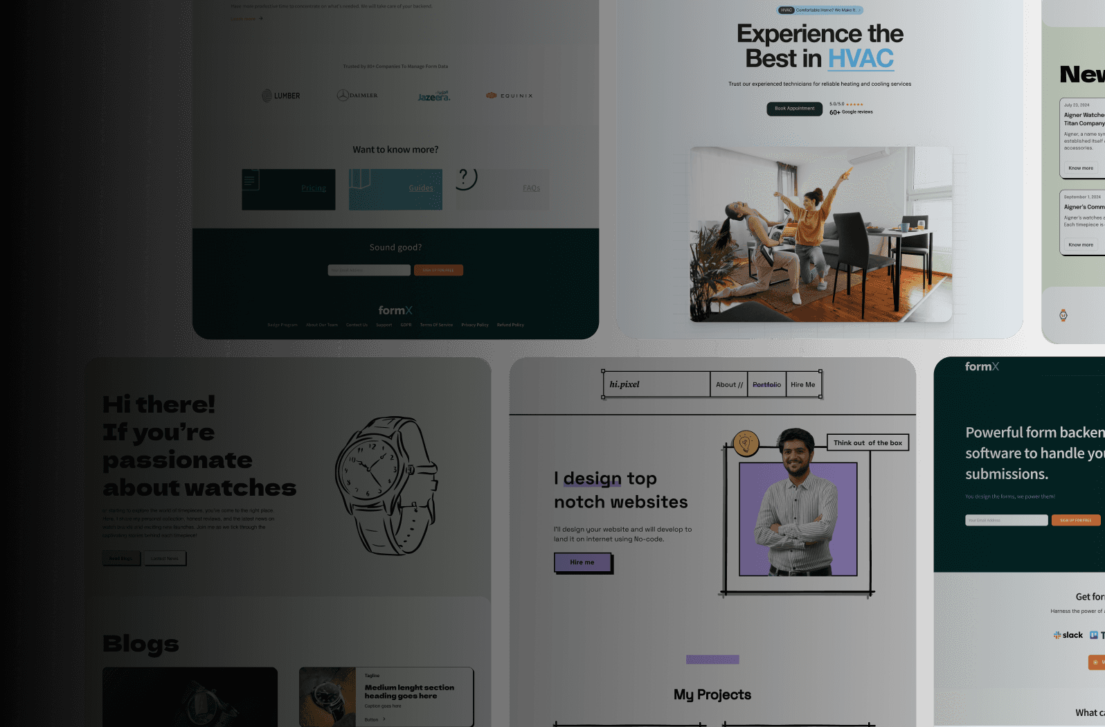
3. Grid-Based Portfolio by Jessica Hische
Looking for portfolio website inspiration? Jessica Hische's portfolio (jessicahische.is) is a prime example of how a grid-based layout can effectively showcase a diverse range of projects. As a renowned lettering artist and illustrator, Hische uses a sophisticated grid system that adapts seamlessly to different screen sizes while maintaining visual harmony. This approach allows her to present an extensive body of work without overwhelming visitors, employing categorization and filtering to facilitate easy navigation. This makes it a fantastic source of portfolio website inspiration, particularly for those with visual-heavy portfolios.

The grid-based approach essentially divides the webpage into a series of columns and rows, creating individual cells where portfolio pieces are displayed. Hische utilizes a masonry-style grid, meaning the grid items vary in height but align to a common baseline, creating a dynamic and visually engaging layout. This is further enhanced by features like thumbnail hover effects and project detail overlays, which provide a richer user experience without cluttering the initial view. Her site features typography, illustration, and client work, all presented cohesively within the grid system. Category tabs further refine the organizational structure, allowing users to quickly filter projects based on their interests. This structured presentation is a major reason why this design deserves a spot on this list of portfolio website inspiration.
This approach offers several advantages. It efficiently displays numerous projects, making it easy for visitors to scan and browse through the work. The inherent visual organization and structure give the portfolio a professional and polished look. This scalability makes it particularly well-suited for growing portfolios, accommodating new additions without disrupting the overall design. For individuals and businesses seeking portfolio website inspiration, Hische’s design provides a compelling model.
However, there are a few potential drawbacks. Grid-based layouts can become visually busy if overloaded with too many items. Maintaining consistent image quality and sizing is crucial for visual harmony. Also, compared to sequential layouts, grid-based designs offer less opportunity for storytelling. Learn more about Grid-Based Portfolio by Jessica Hische and how responsive design principles impact layouts like this. Finally, on mobile devices, grid layouts may necessitate more scrolling.
For those inspired by Hische's portfolio, here are some actionable tips: Use consistent image aspect ratios whenever possible. Implement lazy loading for improved performance, especially with image-heavy sites. Include robust filtering options to aid navigation. Consider thumbnail uniformity for a cleaner aesthetic. And ensure adequate spacing between grid items to avoid a cramped appearance. These practices will help you leverage the power of the grid for a visually impactful and user-friendly portfolio. This structured layout is often popularized by designers like Jessica Hische, influenced by Ethan Marcotte's responsive design principles, and reflects the visual style seen in Pinterest-style layouts, providing abundant portfolio website inspiration for startups, SMEs, agencies, and individual designers.
4. Video Background Portfolio by Karim Rashid
Karim Rashid, the renowned industrial designer, uses a striking full-screen video background on his portfolio website (karimrashid.com) to immediately grab attention and communicate his distinctive aesthetic. This immersive experience showcases his products and installations in dynamic, real-world scenarios, offering a level of context and scale impossible to achieve with static images. The moving imagery, often showcasing the design process or the finished product in use, creates an emotional connection with the visitor and effectively conveys his design philosophy through motion and ambiance. This approach provides portfolio website inspiration for anyone looking to make a strong visual statement.

This method involves using high-quality video footage as the backdrop for the main landing page or even throughout the entire site. Key features include autoplay looping videos, often 15-30 seconds long, with overlay text in strong, legible typography. Integrated video controls, such as a pause button, and optional ambient sound design further enhance the user experience. Rashid's site, for instance, uses video to effectively demonstrate his product designs in real environments and even provides glimpses into his design process, offering valuable portfolio website inspiration to other designers.
This technique is particularly effective for visually-driven portfolios, especially in fields like design, film, and architecture, where showcasing movement and atmosphere is critical. For startups, entrepreneurs, and SMBs, a video background can quickly establish brand personality and create a memorable first impression, leading to a rapid and impactful digital presence. Digital agencies and marketing firms can leverage this approach to create tailored web solutions that resonate with their client's target audience. Even e-commerce platforms could benefit from using short, looping video backgrounds to showcase products in action.
Pros:
Creates immediate visual impact: Captures attention and leaves a lasting impression.
Demonstrates products in motion/use: Provides context and showcases functionality.
Establishes mood and atmosphere: Conveys brand personality and design philosophy.
Communicates brand personality effectively: Differentiates your brand and reinforces your identity.
Shows technical video production skills (for relevant industries): Adds a layer of professionalism for film, animation, and video production portfolios.
Cons:
Significantly increases page load time: Can negatively impact user experience if not optimized.
Can be distracting if poorly implemented: Overly long or complex videos can overwhelm visitors.
Accessibility challenges for some users: Epilepsy warnings and pause controls are crucial.
Mobile data usage concerns: Can consume significant data for mobile users, particularly in the IN region.
Requires high-quality video assets: Poor quality video can detract from the overall impression.
Tips for Implementation:
Optimize video files for web performance: Compress videos without sacrificing quality.
Always include fallback images: Ensure content is visible even if the video fails to load.
Keep videos short and looping (15-30 seconds): Maintain user engagement and prevent distraction.
Consider muting by default with optional sound: Gives users control over the audio experience.
Ensure text remains readable over video backgrounds: Use high contrast and clear typography.
Include pause controls for accessibility: Allows users to stop the video if needed.
Karim Rashid's innovative use of video backgrounds has been adopted by others, notably Apple product pages and film industry portfolios. This powerful technique can elevate your online presence and provide an engaging user experience, making it a worthy addition to any list of portfolio website inspiration.
5. Dark Mode Portfolio by Bruno Simon
Looking for portfolio website inspiration that's both visually striking and technically impressive? Look no further than Bruno Simon's portfolio (bruno-simon.com). This website exemplifies the power of dark mode combined with 3D interactivity, offering a unique and engaging user experience that sets a high bar for creative technology portfolios. This approach deserves a spot on this list because it showcases how a bold design choice like dark mode can elevate a portfolio from static presentation to interactive experience, leaving a lasting impression on visitors.
This innovative portfolio leverages a dark color scheme not just as a stylistic choice, but as a canvas to highlight his expertise in 3D WebGL experiences. Users are invited to navigate an interactive 3D landscape using a custom cursor, effectively "driving" through a representation of Simon's skills and projects. Subtle particle effects and strategically used accent colors further enhance the immersive experience. The dark background itself plays a crucial role, boosting contrast and reducing eye strain, making the complex 3D elements truly pop. This demonstrates that dark mode, when executed correctly, can highlight content rather than obscure it.
Features:
Dark color scheme with high contrast elements
3D interactive WebGL experience
Custom cursor design
Subtle particle effects
Strategic use of accent colors
Performance-optimized animations
Pros:
Reduces eye strain during extended viewing: Particularly beneficial for portfolios showcasing visually rich content like animations or 3D models.
Creates dramatic visual hierarchy: Dark backgrounds naturally emphasize brighter elements, guiding the user's eye and highlighting key information.
Makes colors and animations pop: The increased contrast makes visuals more vibrant and engaging.
Modern, technical aesthetic: Aligns well with technology-focused portfolios, conveying innovation and expertise.
Works well for creative technology portfolios: Ideal for showcasing skills in areas like 3D modelling, animation, and game development.
Cons:
Requires careful contrast management: Ensuring sufficient contrast between text and background is crucial for readability and accessibility.
May not print well: Consider providing a print-friendly version if this is a requirement.
Higher battery consumption on mobile: While the impact might be minimal, it's a factor to consider for mobile users.
Can feel heavy if not balanced with whitespace: Strategic use of whitespace is crucial to prevent the design from feeling overwhelming.
Tips for Implementing a Dark Mode Portfolio:
Ensure text has sufficient contrast (WCAG compliance): Use online contrast checkers to verify readability and accessibility for all users.
Use accent colors strategically for highlighting: Bright accent colors can draw attention to key elements and calls to action.
Consider offering a light/dark mode toggle: Give users the option to choose their preferred viewing mode.
Test on multiple screens for consistent experience: Ensure your design looks and functions correctly across different devices and browsers.
Use subtle textures to add depth to dark backgrounds: This can prevent the design from feeling flat and add visual interest.
Why this approach works:
This portfolio design resonates with the current trends in web design and user experience. Popularized by interfaces like Apple's macOS/iOS dark mode and the rise of the creative coding community, along with gaming interfaces, dark mode offers a sophisticated and modern aesthetic. Bruno Simon's award-winning implementation (FWA and Awwwards recognition) further validates the effectiveness of this approach, particularly for individuals and businesses in the creative technology sector. For startups, entrepreneurs, digital agencies, and web developers in the IN region looking for impactful portfolio website inspiration, Bruno Simon's approach offers a powerful example of how to blend aesthetics, technology, and user experience to create a truly memorable online presence.
6. Typography-Focused Portfolio by Tobias van Schneider
Looking for portfolio website inspiration? Consider the power of typography. Tobias van Schneider's portfolio (vanschneider.com) exemplifies how typography-centered design can create a sophisticated and impactful online presence, making it a worthy addition to this list. This approach uses carefully selected typefaces and typographic hierarchies as the primary design element, making it ideal for showcasing design sensibility and attention to detail. It's particularly relevant for startups, entrepreneurs, SMBs, digital agencies, and web designers seeking a unique and performant website.
This method works by elevating typography to the forefront of the design. Large, bold headlines command attention, while elegant body text ensures a pleasurable reading experience. Instead of relying heavily on images, the typography itself becomes the visual design, communicating your skills and expertise before visitors even delve into your projects. The strategic use of negative space around text further enhances its impact.
Tobias van Schneider's portfolio uses a dramatic typography scale for maximum impact, balancing the text with curated project imagery. This showcases how effective this approach can be. Other key features often found in typography-focused portfolios include:
Custom or carefully selected typefaces: Choosing the right fonts is crucial for establishing the desired aesthetic.
Dramatic type scale contrasts: Varying font sizes creates visual interest and hierarchy.
Typography as primary visual element: Text takes center stage, minimizing the need for other visuals.
Text animations and interactions: Subtle animations can add dynamism to the design.
Minimal use of images in navigation: Streamlines the user experience and improves loading times.
Strategic negative space around text: Breathing room around text enhances readability and visual appeal.
Learn more about Typography-Focused Portfolio by Tobias van Schneider
Pros:
Fast loading compared to image-heavy sites: Less reliance on images drastically improves website performance, crucial for startups and e-commerce platforms seeking rapid digital presence.
Communicates design sensibility immediately: The typography itself conveys professionalism and expertise, perfect for digital agencies and marketing firms looking for tailored web solutions.
Often more accessible and responsive: Simpler designs often translate well across devices, benefiting users and improving SEO.
Projects sophistication and attention to detail: Typography-focused design highlights an understanding of fundamental design principles.
Demonstrates typography skills: This approach is particularly relevant for web designers and developers interested in leveraging typography for impactful design.
Cons:
Requires typography expertise: Careful selection and implementation of typefaces is essential for success.
May need font licensing: Using custom or premium fonts may require licensing fees.
Can feel austere without visual balance: Striking the right balance between text and other visual elements is key.
Requires careful responsive design implementation: Ensuring readability across different screen sizes is crucial.
Tips for implementing a typography-focused portfolio:
Limit to 2-3 typefaces maximum: Too many fonts can create a cluttered and confusing experience.
Create contrast through weight, size, and style: Establish clear visual hierarchy and guide the reader's eye.
Ensure readability across devices: Test your design on various screen sizes and resolutions.
Pay attention to line length and height: Optimize for readability and visual comfort.
Use variable fonts for performance: Variable fonts allow for multiple font variations within a single file, improving loading times.
Consider custom typefaces for uniqueness: A custom typeface can create a truly distinctive brand identity.
This style, popularized by designers like Tobias van Schneider, and rooted in the Swiss design tradition championed by Massimo Vignelli and Josef Müller-Brockmann, offers a unique approach to portfolio website inspiration. By focusing on the power of typography, you can create a website that is both visually striking and highly performant, making a lasting impression on potential clients and employers.
7. Case Study Portfolio by Mike Buzzard
Looking for portfolio website inspiration? The Case Study Portfolio, exemplified by Mike Buzzard (mikebuzzard.com), offers a powerful way to showcase your work, particularly if you're a UX designer, strategist, consultant, or anyone involved in complex projects. This approach prioritizes depth over breadth, focusing on in-depth storytelling about a select few projects rather than a superficial display of many. This makes it a great source of portfolio website inspiration for those wanting to demonstrate their expertise.
This method works by presenting each project as a comprehensive case study, detailing the problem, the process undertaken to find a solution, the challenges faced, and the ultimate outcomes achieved. Think of it as presenting a compelling narrative, not just a finished product. This detailed approach allows potential clients to understand not only what you created but also how and why, offering valuable insights into your strategic thinking, problem-solving skills, and collaborative approach.
Features of a Case Study Portfolio:
Narrative-based project presentations: Each project tells a story, engaging the visitor and providing context.
Problem-solution framework: Clearly defines the challenge and how it was addressed.
Process documentation with visuals: Showcases your workflow and methodology.
Before/after comparisons: Visually demonstrates the impact of your work.
Measurable outcomes and metrics: Provides concrete evidence of your success.
Client testimonials integrated: Adds credibility and social proof.
Pros:
Demonstrates strategic thinking and process: Goes beyond visuals to showcase your expertise.
Shows client relationship management: Highlights your ability to collaborate and understand client needs.
Provides context for design decisions: Explains the rationale behind your choices.
More persuasive than visual-only presentations: Offers a deeper level of engagement and understanding.
Effective for complex or long-term projects: Allows you to showcase the full scope of your involvement.
Cons:
Time-consuming to create and maintain: Requires significant effort to document each project thoroughly.
Requires strong writing skills: Effective storytelling is essential for this approach.
May be too detailed for some visitors: Some may prefer a quicker overview of your work.
Fewer projects can be featured in depth: Focus is on quality over quantity.
Examples and Inspiration:
Besides Mike Buzzard's portfolio, you can find further portfolio website inspiration from resources like Google Ventures design partner portfolios, which often feature comprehensive UX process documentation, and case studies from renowned design firms like IDEO. These examples highlight how the case study approach can effectively communicate the value and impact of design and strategic thinking.
Tips for Creating a Compelling Case Study Portfolio:
Focus on 3-5 strong case studies: Choose projects that best represent your skills and experience.
Include quantifiable results whenever possible: Data and metrics add weight to your claims.
Use visuals to support the narrative, not replace it: Visuals should enhance the story, not be the sole focus.
Structure case studies consistently for easy comparison: A consistent format improves readability and navigation.
Include learnings and challenges, not just successes: Showing how you overcome obstacles demonstrates resilience and problem-solving abilities.
When to Use This Approach:
This approach is particularly valuable for individuals and businesses who offer services that involve strategy, consulting, UX design, or any field where the process is as important as the final product. If you want to demonstrate your expertise and differentiate yourself from the competition, the case study portfolio offers a compelling way to do so. This method resonates well with clients seeking in-depth understanding and valuing strategic thinking, making it a valuable source of portfolio website inspiration, especially for startups, SMEs, agencies, and freelancers in the IN region seeking to establish a strong online presence. This approach has been popularized by individuals like Mike Buzzard, teams like the Google Design team, and organizations like IDEO, demonstrating its effectiveness in various fields.
Portfolio Design Styles Comparison
Portfolio Design | Implementation Complexity 🔄 | Resource Requirements ⚡ | Expected Outcomes 📊 | Ideal Use Cases 💡 | Key Advantages ⭐ |
Minimal Portfolio by Daniel Korpai | Low - simple layout with subtle animations | Low - images, typography, grid system | Clean, distraction-free showcase of work | Designers/developers wanting elegant simplicity | Fast loading, easy navigation, device friendly |
Interactive Storytelling by Robby Leonardi | High - game-like, animation-rich interface | High - advanced dev skills, resources for animation | Highly engaging, memorable user experience | Creative technologists, portfolios needing wow factor | Demonstrates technical creativity, unique UX |
Grid-Based Portfolio by Jessica Hische | Medium - responsive masonry grid with filtering | Medium - image management, filtering functionality | Organized display of diverse project types | Artists, illustrators with many projects | Efficient browsing, scalable, category filtering |
Video Background Portfolio by Karim Rashid | High - full-screen video with overlay text | High - video production, optimization tools | Immersive, mood-setting visual impact | Industrial/product designers emphasizing ambiance | Strong emotional connection, dynamic visuals |
Dark Mode Portfolio by Bruno Simon | High - 3D WebGL interactive experience | High - 3D modeling, WebGL knowledge, performance tuning | Dramatic visual hierarchy, reduced eye strain | Creative tech portfolios, 3D/web developers | Modern aesthetic, eye-friendly, visually striking |
Typography-Focused Portfolio by Tobias van Schneider | Low-Medium - typography-centric with text animations | Low - fonts, typography tools | Sophisticated design sensibility communicated | Designers emphasizing branding and typography | Fast loading, elegant, accessible design |
Case Study Portfolio by Mike Buzzard | Medium - structured narrative with visuals | Medium - writing, visuals, storytelling content | Persuasive project storytelling and strategic context | UX designers, strategists, consultants | Demonstrates process, client management, impact |
Craft Your Digital Masterpiece
Finding portfolio website inspiration is the crucial first step in building a compelling online presence. From minimalist designs like Daniel Korpai's to interactive narratives like Robby Leonardi's and powerful case studies like Mike Buzzard's, the examples explored in this article offer diverse approaches to showcasing your work. Key takeaways include the importance of strong visuals, clear navigation, and a design that reflects your personal brand. Whether you’re a startup in the IN region looking for a rapid launch, an SMB focusing on performance, a digital agency crafting bespoke solutions, or a web developer leveraging cutting-edge tools like Framer, understanding these principles is paramount for success. Mastering these concepts allows you to communicate your unique value proposition effectively, attract the right clients, and ultimately, achieve your business objectives.
Your portfolio isn't just a static collection of projects; it's a dynamic representation of your evolving skills and achievements. Keeping it fresh, relevant, and reflective of your growth is vital for staying competitive in today's digital landscape. By drawing portfolio website inspiration from the best and adapting it to your unique needs, you’re crafting a powerful tool for career advancement and business growth. Now it’s time to turn inspiration into reality. Ready to build your dream portfolio website effortlessly? Explore the diverse templates and intuitive design tools on Framerry and launch your stunning online presence today. Framerry makes bringing your portfolio website inspiration to life easier than ever, regardless of your technical expertise.
Ready to take your animations to the next level?
Discover inspiring portfolio website inspiration with 7 unique examples to elevate your design and impress visitors. Find your perfect style today!


Ready to elevate your website? Let’s bring your vision to life with Framer.