
Discover the Best Google Fonts for Websites in 2025
Discover the Best Google Fonts for Websites in 2025
May 6, 2025

Typography Matters: Choosing the Right Google Font
Your website's typography significantly impacts user experience and brand perception. Choosing the best Google Fonts for websites can be challenging. This list provides nine excellent choices for 2025, helping you quickly select the perfect font for your project. We'll cover popular and versatile options like Roboto, Open Sans, Montserrat, Lato, Poppins, Source Sans Pro, Playfair Display, Nunito, and Merriweather, saving you time and enhancing your site's readability and visual appeal.
1. Roboto
Roboto earns its top spot on our list of best Google Fonts for websites due to its exceptional readability, versatility, and widespread familiarity. As the system font for Android, it's designed for optimal display on screens of all sizes, making it a perfect choice for websites targeting users in India and beyond, especially considering the increasing mobile browsing trends. This neo-grotesque sans-serif typeface boasts a clean, modern aesthetic that suits a wide range of website styles, from minimalist blogs to corporate landing pages.

Roboto’s comprehensive font family, ranging from Thin to Black, offers remarkable flexibility. This allows designers to establish clear visual hierarchies within the website content, using lighter weights for body text and bolder weights for headings. This versatility makes Roboto a highly effective tool for creating engaging and accessible user experiences, critical for startups, SMEs, and e-commerce platforms seeking to establish a rapid and effective digital presence. Its extended character support caters to multiple languages, a crucial feature for businesses targeting diverse audiences in India. Furthermore, its geometric yet humanist design approach strikes a balance between modern and approachable, contributing to a positive user experience.
For web designers and developers, integrating Roboto is seamless. It's readily available through Google Fonts (https://fonts.google.com/specimen/Roboto), meaning it's free to use and requires minimal setup. This drastically simplifies the website development process, especially for digital agencies and marketing firms working on client projects with tight deadlines. Being a Google Font, it also contributes to optimized page load speeds, a crucial factor for website performance and SEO, a benefit that resonates with businesses aiming for performance optimization.
Features:
Complete font family (Thin to Black)
Extended character support for multiple languages
Designed for screen readability
Condensed and slab serif variants available
Geometric yet humanist design
Pros:
Excellent readability on desktop and mobile
Versatile for headings and body text
Large character set supports international content
Widespread familiarity due to its status as the Android system font
Cons:
Overuse can make it feel generic
Might not be distinctive enough for some brands
Certain weights may appear less refined than premium alternatives
While Roboto's popularity can be a double-edged sword, making it a somewhat safe choice, its sheer versatility, readability, and ease of implementation solidify its place as one of the best Google Fonts for websites. Especially for businesses in India focusing on rapid digital growth and optimized performance, Roboto offers a reliable and effective typographic solution. Its free availability and seamless integration make it a particularly attractive option for startups, SMEs, and agencies seeking cost-effective yet high-quality web solutions.
2. Open Sans
Open Sans is a highly versatile and popular choice among the best Google Fonts for websites, especially for those prioritizing readability and a clean aesthetic. Designed by Steve Matteson and commissioned by Google, this humanist sans-serif typeface boasts an upright stress, open forms, and a neutral appearance meticulously optimized for print, web, and mobile interfaces. Its widespread use speaks to its effectiveness in conveying clarity and ensuring accessibility across various applications, making it a strong contender for businesses, startups, and agencies seeking a reliable and performant typeface.
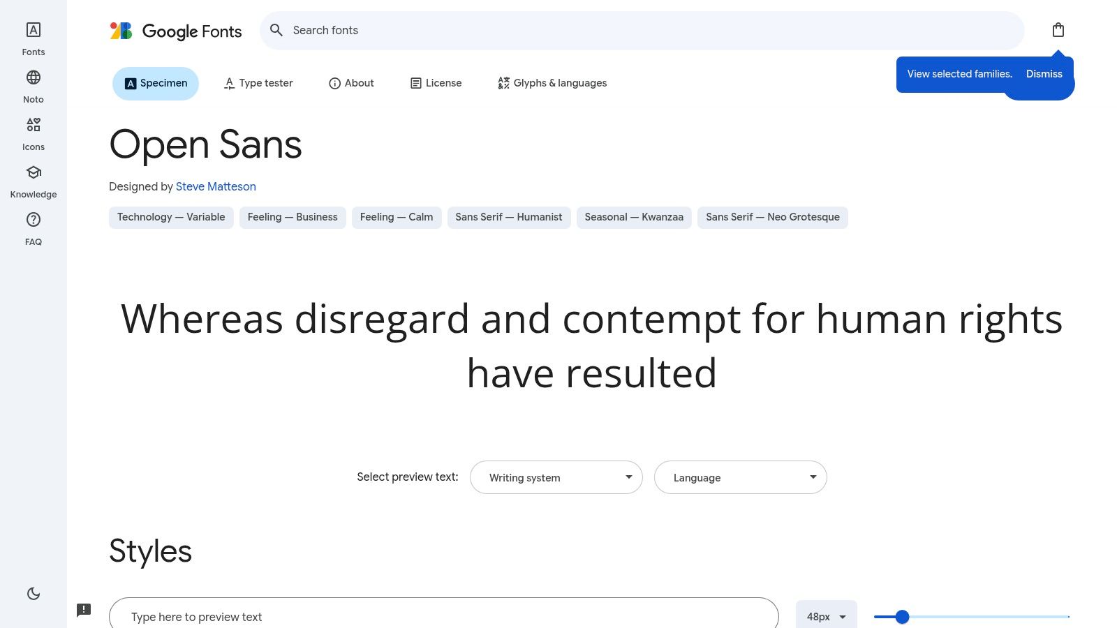
Open Sans's key strength lies in its exceptional legibility. The typeface offers 10 styles ranging from Light to Extra Bold, including italics, providing flexibility for diverse design needs. Its optimized design ensures consistent rendering across different browsers and devices, a crucial factor for businesses targeting users in India and globally. This cross-platform consistency contributes significantly to a positive user experience, regardless of the device used to access the website.
For startups and entrepreneurs rapidly building their digital presence, Open Sans offers a quick and reliable solution. Small and Medium-Sized Businesses (SMBs) aiming for performance optimization will also appreciate its efficient loading times, contributing to better Core Web Vitals. Digital agencies and marketing firms looking for tailored web solutions can leverage Open Sans as a solid foundation for diverse projects, while web designers and developers benefit from its easy implementation and broad compatibility. E-commerce platforms, particularly those requiring quick, custom website builds, will find its versatility a valuable asset.
Features:
10 styles from Light to Extra Bold (including italics)
Optimized for legibility across digital interfaces
Clean and neutral character design
Excellent x-height for readability
Open counters and friendly terminals
Pros:
Extremely readable even at small sizes, making it ideal for body text and mobile devices.
Works well for both headlines and body text, offering stylistic flexibility.
Pairs well with many other fonts, simplifying the design process.
Renders consistently across different browsers and devices, ensuring a uniform user experience.
Cons:
Very common, which can make a website feel less distinctive. This might be a concern for brands seeking a unique identity.
Some designers find it plain compared to more stylized alternatives.
Character spacing can feel slightly wide in certain contexts, potentially requiring adjustments.
Website: https://fonts.google.com/specimen/Open+Sans
Implementation Tips:
Open Sans is readily available on Google Fonts and can be easily implemented through a simple code snippet added to your website's <head>. As a free and open-source font, there are no licensing fees or technical requirements beyond including the correct link. Its widespread use and availability also mean extensive community support and documentation are readily available.
Open Sans's neutrality makes it a safe and effective choice for various web projects. While it may lack the distinctive personality of some other fonts, this neutrality allows it to blend seamlessly into different design aesthetics. By focusing on core typographic principles like legibility and clarity, Open Sans earns its place amongst the best Google Fonts for websites, especially for businesses prioritizing a user-friendly and accessible online experience.
3. Montserrat
Montserrat earns its spot on our list of best Google Fonts for websites due to its elegant sans-serif design and versatility. Inspired by the urban typography of Buenos Aires' Montserrat neighborhood, this typeface, created by Julieta Ulanovsky, beautifully captures the geometric yet warm aesthetic of the early 20th century. This makes it a popular choice for websites aiming for a contemporary and timeless look. This font is particularly relevant for businesses in the IN region looking to establish a strong digital presence, much like the guidelines discussed in this article: Learn more about Montserrat.

Montserrat offers a wide range of 18 styles, from Thin to Black, including italics. This extensive weight range allows for excellent hierarchy within your website's typography. Its distinctive geometric character with humanist touches gives it a strong, confident feel, especially in uppercase. Furthermore, the availability of alternate characters and an extended Latin character set provides additional flexibility for designers. As a Google Font, Montserrat is free to use, making it an accessible choice for startups, SMBs, and agencies alike.
One of Montserrat's biggest strengths is its ability to project a strong personality while remaining highly readable, a crucial factor for any website aiming for optimal user experience. It's particularly effective for headlines and branding, creating a modern and clean aesthetic that suits contemporary web designs. For entrepreneurs and businesses seeking rapid digital presence, this font offers a quick and stylish solution for establishing brand identity. Digital agencies and marketing firms looking for tailored web solutions can leverage Montserrat's versatility for a range of clients.
However, there are a few considerations. Some of the heavier weights can appear too dense for large blocks of body text, so careful selection and pairing with other fonts may be necessary. Letter spacing adjustments might be required at certain sizes to ensure optimal readability. Finally, its increasing popularity means it's becoming more commonplace in web design, potentially impacting the unique feel it initially offered.
Features:
18 styles from Thin to Black (including italics)
Distinctive geometric character with humanist touches
Strong, confident uppercase characters
Alternate characters available
Extended Latin character set
Pros:
Strong personality while maintaining readability
Works exceptionally well for headlines and branding
Modern and clean aesthetic that suits contemporary designs
Versatile weight range for creating hierarchy
Free to use
Cons:
Some weights can appear heavy in body text applications
Letter spacing may require adjustment in certain sizes
Increased popularity means it's becoming more common in web design
Website: https://fonts.google.com/specimen/Montserrat
4. Lato
Lato is a strong contender among the best Google Fonts for websites, especially for businesses seeking a blend of professionalism and approachability. Designed by Łukasz Dziedzic, this sans-serif typeface strikes a balance between classic proportions and modern geometric forms. Its name, meaning "Summer" in Polish, reflects the warmth imbued by its semi-rounded details. This subtle touch softens the overall look without compromising the sturdy structure that conveys stability and seriousness. This duality makes Lato particularly effective for companies aiming to project a trustworthy yet inviting image.

Lato's versatility extends across a wide range of applications, from corporate websites and e-commerce platforms to digital marketing materials. Startups, SMEs, and digital agencies in India can leverage its clean and readable design to establish a strong online presence. Its extensive character set, supporting over 100 Latin-based languages, makes it particularly useful for businesses targeting diverse audiences. Furthermore, the meticulous attention to spacing and kerning ensures optimal readability across different devices and screen sizes. This is crucial for ensuring a positive user experience and boosting engagement.
Features:
9 weights from Hairline to Black (including italics)
Semi-rounded details for a warm appearance
Balanced letterforms with classical proportions
Extended character set (100+ Latin-based languages)
Optimized spacing and kerning
Pros:
Highly readable in both display and body text
Projects warmth while maintaining professionalism
Excellent for corporate, business, and e-commerce websites
Versatile across various industries and design styles
Free to use through Google Fonts
Cons:
Some characters (e.g., lowercase 'a') can appear unusual at larger sizes
Heavier weights can lose some distinction between letterforms
Increasingly common in web design, potentially impacting uniqueness
Implementation Tips:
Implementing Lato on your website is straightforward. Simply select the desired weights and styles through Google Fonts (https://fonts.google.com/specimen/Lato) and embed the provided code snippet into your website's HTML. You can then apply the font using CSS to specific elements, ensuring a consistent and professional look across your site.
Comparison:
Lato often gets compared to other popular sans-serif fonts like Open Sans and Roboto. While all offer excellent readability, Lato’s distinct semi-rounded details provide a warmer feel than the more neutral Open Sans. Roboto, while geometrically similar, can appear slightly more condensed. This subtle difference gives Lato a unique personality that can be a valuable asset in establishing brand identity.
Lato's free availability through Google Fonts, coupled with its versatility and readability, makes it an excellent choice for businesses in the IN region looking to establish a strong and approachable online presence. Whether you’re a startup, SME, or a large corporation, Lato offers a reliable and professional typographic solution that can enhance your website’s design and user experience.
5. Poppins
Poppins is a standout choice among the best Google Fonts for websites, especially for those seeking a modern and clean aesthetic. Developed by the Indian Type Foundry and Jonny Pinhorn, this geometric sans-serif typeface offers a unique internationalist approach, supporting both Devanagari and Latin writing systems. This makes it particularly relevant for businesses in the IN region catering to a diverse audience. Its geometric construction, coupled with optical adjustments, results in a typeface that is both visually appealing and highly readable, making it a popular choice for websites aiming for a contemporary, tech-forward look.

Poppins offers a wide range of 18 styles, from Thin to Black, including italics. Its monolinear letterforms with minimal contrast and distinctive circular forms contribute to its clean and modern feel. This versatility allows for effective use in various contexts, from prominent headlines and UI elements to body text. For startups and entrepreneurs in India looking to establish a rapid digital presence, Poppins provides a professional and contemporary typographic solution. Similarly, small and medium-sized businesses, digital agencies, and e-commerce platforms can leverage Poppins to achieve a polished and modern website design. Web designers and developers will appreciate its clean lines and extensive weight range. As a free Google Font, there are no licensing fees or technical requirements beyond embedding the font into your website's code.
One of the key advantages of using Poppins is its excellent balance between geometric precision and readability. While some geometric sans-serif fonts can sacrifice readability for style, Poppins manages to achieve both. This makes it a suitable choice for both headlines and body text, though for exceptionally long-form content, other sans-serif options might be slightly more comfortable for readers. Its distinctive character, while maintaining versatility, helps brands create a unique visual identity. However, its growing popularity might lessen this distinctiveness over time. Also, some of the heavier weights might appear too bold at smaller sizes, requiring careful consideration during implementation. Learn more about Poppins and how font choices impact website speed. Optimizing your website's performance is crucial, and understanding the implications of your chosen fonts is a step in the right direction.
Compared to similar geometric sans-serif fonts like Montserrat or Open Sans, Poppins possesses a slightly more refined and contemporary feel. Its support for the Devanagari script is a significant advantage for websites targeting audiences in India. Implementing Poppins is straightforward, simply select the desired weights and styles from the Google Fonts website and embed the provided code snippet into your website's HTML. By carefully selecting appropriate weights and sizes, you can leverage Poppins to create a website that is both visually appealing and highly effective in communicating your brand message. Poppins truly deserves its place on this list of best Google Fonts for websites due to its versatility, modern aesthetic, and cross-cultural support, making it an ideal choice for businesses and individuals seeking a clean and contemporary online presence.
6. Source Sans Pro
Source Sans Pro earns its place among the best Google Fonts for websites due to its exceptional legibility, UI-focused design, and robust performance. This makes it a particularly strong choice for startups, entrepreneurs, SMBs, digital agencies, and e-commerce platforms in India looking to establish a clean, professional online presence. Developed by Adobe, this open-source typeface family prioritizes readability and versatility, making it a reliable workhorse for diverse web design projects.
This font is completely free to use, thanks to Adobe's open-source initiative. This makes it a cost-effective choice for businesses of all sizes, especially startups and SMBs in India looking to minimize expenses while building a strong online presence. There are no licensing fees or technical requirements beyond including it in your website's code.
Source Sans Pro was specifically designed for user interfaces, meaning it excels in website navigation menus, buttons, body text, and other on-screen elements. Its semi-condensed proportions contribute to space efficiency, crucial for maximizing content display, especially on smaller screens prevalent in the IN region.
Features:
12 Styles: From ExtraLight to Black, including italics, offering flexibility for various design needs.
UI Focused: Designed specifically for user interfaces, ensuring optimal readability and usability.
Space-Efficient: Semi-condensed proportions maximize content display within limited screen space.
Optimized Rendering: Designed for clear and consistent display across different browsers and devices.
Open Source: Free to use and regularly updated by Adobe, ensuring ongoing support and improvements.
Pros:
Excellent Legibility: Clear and easy to read at various sizes and resolutions, improving user experience.
Space-Saving Design: Works well in UI elements and navigation, maximizing content display.
Professional Pedigree: Adobe's reputation ensures high quality and ongoing development.
Consistent Rendering: Appears consistently across different platforms and browsers.
Cons:
Utilitarian Aesthetic: Can appear less distinctive compared to more stylized fonts.
Tight Character Spacing: May require adjustments in certain applications for optimal visual appeal.
Less Distinctive: Might not stand out as much as some trending font alternatives. However, this neutrality can be an advantage for websites prioritizing clarity and professionalism over visual flair.
Comparison:
While Open Sans is another popular and similar option for body text, Source Sans Pro offers slightly tighter letter spacing, making it more space-efficient. Roboto, another commonly used Google Font, has a more rounded and geometric feel. Source Sans Pro's relatively neutral aesthetic falls somewhere in between, allowing it to blend seamlessly into diverse design schemes.
Implementation:
Implementing Source Sans Pro on your website is straightforward. Simply include the following line of code in your website's <head> section:
Then, apply the font-family to the desired elements in your CSS:
body { font-family: 'Source Sans Pro', sans-serif; }
Website: https://fonts.google.com/specimen/Source+Sans+Pro
Source Sans Pro's clean lines, excellent legibility, and UI-focused design make it a powerful choice for anyone seeking a best google fonts for websites, particularly in the context of the IN region's growing digital landscape. Its open-source nature and performance benefits solidify its value proposition for startups, entrepreneurs, SMBs, agencies, and e-commerce ventures striving for impactful and accessible online experiences.
7. Playfair Display
Playfair Display is a sophisticated serif typeface that can elevate the look of any website. It's a popular choice among web designers looking to add a touch of classic elegance and is readily available as one of the best Google Fonts for websites. Its design, inspired by the transitional serif typefaces of the late 18th century, makes it a standout choice for headlines, titles, and other prominent text elements. This font specifically caters to websites aiming for a refined and luxurious aesthetic.
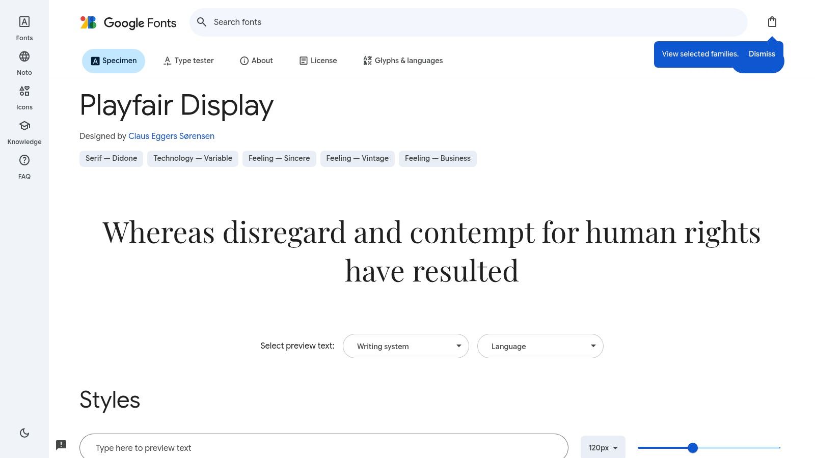
Designed by Claus Eggers Sørensen, Playfair Display's high contrast between thick and thin strokes lends it a dramatic flair. This characteristic makes it highly effective at larger sizes, instantly drawing the eye and conveying a sense of importance. Its distinctive calligraphic elements, elegant ball terminals, and serifs contribute to its overall refined appearance. Being free to use and readily accessible through Google Fonts makes it a practical and budget-friendly choice for startups, SMBs, and agencies alike.
Playfair Display offers six styles across Regular, Medium, and Bold weights, including italics. This allows for some flexibility in design, although the limited weight range compared to some other font families is worth noting. It's important to remember that its high contrast makes it unsuitable for body text or small sizes, where legibility would be compromised. For body text, consider pairing it with a complementary sans-serif font like Open Sans or Montserrat for a balanced and readable design. This combination provides both visual interest and optimal readability – crucial for a positive user experience.
Features:
6 styles (Regular, Medium, Bold, and their italic variants)
High contrast between thick and thin strokes
Distinctive calligraphic elements
Elegant ball terminals and serifs
Designed specifically for display and headline use
Pros:
Adds instant sophistication and elegance to website designs
Perfect for luxury, fashion, and editorial websites
Creates striking headlines and titles
Pairs beautifully with many sans-serif body fonts
Free to use via Google Fonts
Cons:
Not suitable for body text or small sizes due to high contrast
Heavy weights can lose some refinement at very large sizes
Limited weight range compared to some font families
Website: https://fonts.google.com/specimen/Playfair+Display
Implementation Tip: When using Playfair Display, experiment with different font pairings for body text to find the combination that best suits your website's aesthetic. Start with popular choices like Open Sans, Montserrat, or Lato, and adjust the font sizes and line heights for optimal readability.
Playfair Display deserves its place on this list of best Google Fonts for websites due to its ability to instantly elevate a design with its classic elegance. Its free availability and ease of implementation through Google Fonts further solidify its value, particularly for businesses and individuals looking to create a strong visual impact without incurring extra costs. This makes it an invaluable resource for anyone looking to establish a sophisticated digital presence, from startups to established businesses in the IN region and beyond.
8. Nunito
Nunito is a versatile sans-serif typeface among the best Google Fonts for websites, offering a balanced blend of friendliness and professionalism. Designed by Vernon Adams and later expanded by Jacques Le Bailly, it started as a rounded terminal font primarily for display use. However, it has since evolved into a comprehensive font family suitable for both headings and body text. Its rounded terminals lend a soft, approachable feel, while the well-balanced letterforms and comfortable proportions ensure excellent readability. This makes Nunito a popular choice for websites aiming for a welcoming yet professional aesthetic, especially in India where a friendly online presence is highly valued.
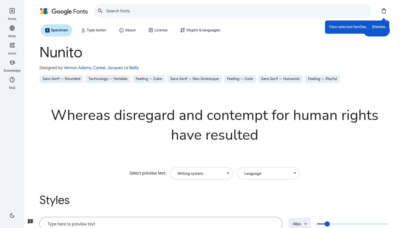
Nunito's key features include 14 styles ranging from ExtraLight to Black (including italics), rounded terminals for a soft appearance, well-balanced letterforms, extended Latin character support, and a balanced x-height for optimal readability. As one of the best Google Fonts for websites, it's completely free to use, making it an attractive option for startups, small businesses, and e-commerce platforms looking to establish a rapid and cost-effective digital presence. Learn more about Nunito as a powerful tool for creating responsive layouts. This is especially relevant for businesses in the IN region targeting mobile users.
Its friendly and approachable character, without appearing childish, makes it highly versatile. Nunito works exceptionally well for websites in sectors like education, healthcare, and service-oriented businesses where a warm and inviting tone is paramount. For digital agencies and marketing firms, Nunito provides a solid typographic foundation for building client websites that are both visually appealing and highly functional.
While Nunito offers many advantages, it's crucial to consider its potential drawbacks. The rounded terminals might not align with more serious or traditional brand aesthetics. For some corporate or formal applications, it could be perceived as too playful. Some designers also find the spacing between certain letter pairs needs adjustment. Therefore, while Nunito is among the best Google Fonts for websites striving for a friendly feel, it's essential to ensure it aligns with your overall brand identity. If you're building a website for a law firm or a financial institution, you might consider more traditional and formal typefaces. However, for a vibrant startup or an engaging e-commerce platform, Nunito can be a perfect fit. You can preview and experiment with different Nunito styles on the Google Fonts website.
9. Merriweather
Merriweather is a robust serif typeface designed specifically for screen readability, earning its place among the best Google Fonts for websites. Crafted by Eben Sorkin, it shines in long-form content, offering a blend of scholarly sophistication and approachable clarity. This makes it a particularly strong choice for Indian businesses looking to establish credibility and authority in their online presence, whether it's through detailed blog posts, informative articles, or comprehensive product descriptions.

Its tall x-height, slightly condensed letterforms, open forms, and subtle diagonal stress contribute to its legibility even at smaller sizes. This is a significant advantage for websites viewed on diverse devices across India, where mobile usage is prevalent. The slightly condensed design also makes Merriweather space-efficient, allowing for more text to fit comfortably on the screen. This is especially useful for startups and SMBs who want to maximize content delivery without compromising readability. For digital agencies and web developers, Merriweather provides a reliable and professional typographic foundation for a wide range of client projects.
Merriweather offers eight styles across Regular and Bold weights, including italics. This provides enough flexibility for creating visual hierarchy and emphasis within the text. The strong, robust serifs render well across various screen resolutions and sizes, ensuring consistent brand presentation.
Features:
8 styles (Regular, Bold, and their italics)
Designed for screen readability
Slightly condensed letterforms
Tall x-height
Strong, robust serifs
Pros:
Exceptional readability for long-form content
Distinctive yet professional character
Clear rendering at smaller sizes
Conveys authority and credibility
Cons:
Heavier weights can appear dense in some applications
Not as versatile for minimalist or ultra-modern designs
Requires careful line-height adjustment for optimal readability
Implementation Tips:
Line Height: Pay close attention to line height. A slightly larger line height (around 1.5 to 1.7) is generally recommended with Merriweather to enhance readability further.
Pairing: Merriweather pairs well with sans-serif fonts like Open Sans or Montserrat for headings and subheadings, creating a balanced and visually appealing typography.
Context: Consider the overall design aesthetic of your website. While Merriweather excels in professional and content-rich environments, it might not be the best fit for very modern or minimalist designs.
Being a Google Font, Merriweather is free to use, both personally and commercially, simplifying budget considerations for startups and businesses. It's readily available through the Google Fonts library and easy to implement on any website. This accessibility, combined with its readability and professional aesthetic, solidifies Merriweather as an excellent choice among the best Google Fonts for websites, particularly for those aiming for a credible and impactful online presence in the Indian market. Visit the Google Fonts website to explore and implement Merriweather: https://fonts.google.com/specimen/Merriweather
Top 9 Google Fonts Comparison
Font Name | Core Features / Style ✨ | Readability & UX ★★★★☆ | Target Audience 👥 | Unique Selling Points 🏆 | Popularity & Distinctiveness |
Roboto | Multiple weights, extended multilingual support | Highly legible on all screens | Broad, Android/system users | Google’s official Android font, versatile | Very popular 💰, but can feel generic |
Open Sans | 10 styles, upright stress, neutral design | Excellent legibility, consistent rendering | General web use, accessibility focus | Friendly, pairs well with many fonts | Very common, less distinctive |
Montserrat | 18 styles, geometric + humanist touches | Strong readability, best for headlines | Branding, contemporary & creative sites | Bold personality, alternate chars available | Growing popularity but less common than Roboto |
Lato | 9 weights, semi-rounded, classical proportions | Warm yet professional, great balance | Corporate, business | Warmth + professionalism blend | Increasingly common in web design |
Poppins | 18 styles, true geometric, multilingual | Good for headlines/UI, less for long text | Tech startups, modern brands | Devanagari support, modern geometric design | Popular but risk of overuse |
Source Sans Pro | 12 styles, UI-specific, semi-condensed | Excellent for UI/navigation | UI/UX designers, digital products | Adobe pedigree, open-source, space-efficient | Useful but can feel utilitarian |
Playfair Display | 6 styles, high contrast serif | Best at large sizes, elegant display only | Luxury, fashion, editorial | Sophisticated, strong calligraphic features | Niche for headlines, not body text |
Nunito | 14 styles, rounded terminals | Friendly, approachable, great for reading | Education, healthcare, services | Soft rounded details, versatile | Somewhat playful, less formal |
Merriweather | 8 styles, screen optimized serif | Exceptional for long-form content | Publications, blogs, scholarly sites | Tall x-height, space-efficient | Professional but less modern aesthetics |
Making the Right Choice for Your Projects
Choosing the best Google Fonts for your website can significantly impact its overall design and user experience. We've explored a range of versatile options, from the clean lines of Roboto and Open Sans to the more distinctive styles of Playfair Display and Merriweather. Remember, the fonts you select should complement your brand identity and resonate with your target audience. Whether you're a startup, a small business, or an e-commerce platform, the right typography can elevate your online presence. Key takeaways include considering readability, font pairings, and the overall aesthetic you want to achieve. For example, pairing a robust serif like Merriweather with a clean sans-serif like Lato can create a balanced and visually appealing design. Similarly, using Montserrat for headings and Open Sans for body text offers a modern and professional feel.
When choosing the right Google Font, it's crucial to consider its impact on your website's overall performance. A fast-loading website is essential for a positive user experience and better search engine rankings. To ensure your chosen font doesn't slow down your site, you can optimize website speed from CLDY. Experimenting with different font combinations is key to finding the perfect match. By carefully considering these factors, you can leverage the power of Google Fonts to create a website that is both visually appealing and highly effective.
Ready to create a stunning website with perfectly paired Google Fonts? Framerry offers expert design assistance and tailored web solutions to help you achieve a polished and professional online presence. Let Framerry help you select the ideal typography to enhance your brand and captivate your audience. Visit Framerry today to explore the possibilities.
Ready to take your animations to the next level?
Explore the best Google Fonts for websites in 2025 to boost readability and style. Find the perfect fonts to elevate your site’s design today!


Ready to elevate your website? Let’s bring your vision to life with Framer.